Tuesday, January 31, 2012

Texture, Part 1

I am a bit of an expert on seamless tiling textures, since I created nearly all of the paper textures that ever shipped with Painter, Dabbler, Sketcher, and Detailer. But, how they were created?

This is the first post of many that actually resurrects the application, called Texture, which was used to create all the paper textures in Painter. This application hasn't run since 1996, and was forgotten until now. It was a secret application, that never saw the light of day outside the walls of Fractal Design and my house. But history is littered with lost arts. So now I will show you the art of making stuff that helps you to make art.

Speckles

It mixed tiling patterns with Fourier transforms with speckles. A speckle (or speckle pattern) is a set of points in the plane that repeats. But one where you almost can't see the tiles.

I show you one to the right, which has about 1.4 repeats of the tile in it. It does take some time to see the repeat, but it is there.

As opposed to the harsh repeat pattern of rectangular tiles, a speckle is visually pleasing and it is intended to be totally seamless.

It also seems like a very good start for creating paper textures because the texture has only one predominant spatial frequency. Now, a typical paper texture in Painter is 256x256 pixels, although they are scalable. This speckle has 1000 points in the tile, meaning that any derived paper texture will have about (256 x 256) / 1000 or about 65 pixels per item in the texture.

Creating a Speckle

First, the a tile is seeded with a number of random points. Lets say that you have constructed a function urand(), that returns a random floating point number on the range 0...1. Then the following code will suffice to create a random 1000-point speckle:

#define MAXSPECKLE 10000
int i, npoints = 1000;
point speckle[MAXSPECKLE];
for (i = 0; i < npoints; i++)
{
    speckle[i].x = urand();
    speckle[i].y = urand();
}

The random speckle is shown to the right. The dots are smaller because the average minimum distance is quite small, and we need to be able to see the individual dots.

Then we do an interesting trick. We iterate an anti-gravity transform to push the points apart in the plane. This uses a technique of mutual-avoidance to make them regularly spaced.

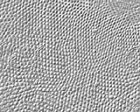
After about 10-12 iterations of the mutual-avoidance transform, this set of speckles looks like the one shown to the right. The spots are larger again because the average minimum distance has reached a steady state of about 6 to 8 pixels.

Tiling Math

On a wrap-around tile, certain things we take for granted like distance formulas become a bit different. For any two points p1 and p2, the distance can't be calculated in the normal way. We must account for the wrap-around.

To do that, we have to make a wrap-around rule that says if a point is more than one-half a tile forwards, then the image of that point behind us is really the one we want.

So, something like point-to-point distance becomes a bit more complicated:

float dist(point p1, point p2)
{
    float dx, dy;
    dx = p1.x - p2.x;
    if (dx > 0.5) dx -= 1.0; else if (dx < -0.5) dx += 1.0;
    dy = p1.y - p2.y;
    if (dy > 0.5) dy -= 1.0; else if (dy < -0.5) dy += 1.0;
    return sqrt(dx*dx + dy*dy);
}

The above function implements the wrap-around rule for a tile that repeats in both x and y.

To implement the mutual-avoidance iteration, we first make a pass over all the points in the speckle, looking for neighbors within a small distance. This optimum distance is usually computed in the following way:

effectRadius = 2.5 * sqrt(2 / (points * sqrt(3)));

This assumes that the tightest packing of points is a triangular packing. The 2.5 is thrown in as a fudge factor to make sure we get enough neighbors to do the right thing. Then we compute a motion vector for the point that is designed to push it away from its nearest neighbors. The following code shows this motion vector gathering pass. Note that, to right I have placed the initial state and the first six iterations of mutual avoidance, so you can see the effects of the iteration.


int i, j;

float d, mindist, avgmindist;
point *p1, *p2;
vector vs;
avgmindist = 0;
for (i = 0; i < npoints; i++)
{
    p1 = &speckle[i];
    vs = vector(0,0);
    mindist = 1;

    for (j = 0; j < npoints; j++)

    {
        if (j == i)
            continue;
        p2 = &speckle[j];
        d = dist(p1, p2);
        if (d > effectRadius)
            continue;
        if (d < mindist)
            min_d = d;
        vs += (*p1 - *p2) / (d*d);
    }

    p1->v = vs;

    p1->dv = length(vs);
    p1->mindist = mindist;
    avgmindist += mindist;
}
avgmindist /= npoints;

The above code also computes an average minimum distance, so we can properly scale the motion vectors for the points.

Next, we compute the sum over all motion vectors' velocities (lengths) and create a factor that helps us normalize the motion vectors.

float dvs, factor;

dvs = 0;

for (i = 0; i < npoints; i++)
{
    p1 = &speckle[i];
    dvs += p1->dv;
}
dvs /= npoints;
if (dvs == 0)
    factor = 1;
else
    factor = (effectRadius * 0.04) / dvs;

This factor can be used to scale the motion vectors to complete the avoidance iteration. The points are now moved. They must be placed back on the tile if they wander off, of course.

for (i = 0; i < npoints; i++)
{
    p1 = &speckle[i];
    p1 += factor * p1->v; // move the point

    if (p1->x < 0.0)
        p1->x += 1.0;
    else if (p1->x >= 1.0)
        p1->x -= 1.0;
    if (p1->y < 0.0)
        p1->y += 1.0;
    else if (p1->y >= 1.0)
        p1->y -= 1.0;
}

And that's how mutual avoidance works, in a nutshell.

The best thing about speckles is that they can also be used for so many other things. One of these is visually interesting, since it mimics the arrangement of cells in the back of your eye. For instance, to the right we can see a section of the human fovea, the dense cluster of photoreceptor cells in the back of your eye. It is interesting how often cells land in a hexagonal tight-packing.

One day, when implementing Texture, I came across a computation geometry trick called Voronoi maps. These are like a cellular partitioning of space around a set of points. Arranged so each point gets its own well-defined little capsule of space. This technique was very interesting visually.

Here you see a Voronoi map applied to a speckle. The speckle was created by starting with 100 random points and iterating the mutual avoidance iteration a mere 9 times.

Then a Voronoi map was created on the tiling plane. This is a bit trickier than constructing a Voronoi map in general, but really only the distance function needs to change.

I won't go into how I create them, but I will give a link to a remarkably efficient technique for creating them. Most techniques for creating these maps depend upon the simple in-circle test.

But there are other ways to treat points: connecting them. An example of this is called a tree of points.

Spanning Trees

A spanning tree is a single graph that connects all the points of the graph, but which does not contain a single loop. To construct one, maintain a tree number for each point. When you connect two points, set their tree numbers to the minimum of the two tree numbers of the two points. Do not connect them if they have the same tree number, since that would imply a loop.

So, the art in spanning trees can be put simply: in what order do we connect the points?

I call this the function type of the spanning tree.

This kind of function is used in constructing halftone dot patterns as well, but that's a post for another day!

Here we have one spanning tree, constructed so that the bonds are favored to fan out from the center.

This kind of tree is useful in producing growth-like looks. Really, it is more like the growth of bacteria or lichens, since it is constrained to lie in the plane.

Another kind of spanning tree is constructed on the same points, but in this case, it is designed so the bonds are favored in a direction perpendicular to those of the first spanning tree. This is useful in creating rose-petal patterns and even fingerprint patterns.

There are more things you can do with speckles, and bridging the gap between geometry and image processing is the key.

We will talk more about that in future Texture posts.

But, have no fear, I have taken step 1 in bringing the art of creating paper textures back from the dead!


Saturday, January 28, 2012

Patterns, Part 3

In Patterns, Part 1, we looked at planar tilings, and the graph-theoretic ways of looking at them, and in Patterns, Part 2, we also looked at space-filling curves generated by patterns.

Also, these mix-and-match patterns can be quite interesting when we introduce global rules that control which elements can join up with which other elements. We can use rules of continuity, logic, topology, and aesthetics. Still, there are more interesting mix-and-match groups to examine from the pattern elements we discussed last time before we move on to rule-based patterns.

An example of a logic- and aesthetics-based pattern is shown at right. These forms of intertwining descend from the runic intertwinings popular in the time of Harald Blåtand (Harold Bluetooth, for whom the Bluetooth NFC standard is named), as seen on the Jelling stone.

Bases and Their Patterns

I also introduced the notion of a random basis set for a pattern. This is a small set of shapes that each live within a square area (the definition area). The interesting thing is setting it up so the patterns meet up. This takes a little thought, but really it is only this: the centers of the four sides of the square all have something connected to it.

I modified my pattern application to allow me to select a set of elements to use as a basis. Last time, I was relying on fixed predetermined sets.

This pattern looks like a broken lattice. Upon closer examination, it shows a branching from the top right towards the left and bottom.

This behavior is, of course, heavily influenced by the basis for the pattern. Elements are chosen at random from the basis set, and placed on a grid so the squares fit together without gaps.

The basis set for this pattern is shown above. Because it only contains branches moving off to the bottom and to the left, this has controlled the branching of the random pattern itself. The addition of a vertical cross-over element adds a little dimensionality to it.

But the branches are not rooted anywhere. That got me thinking. I could change up the basis set to control that.

Here is a modified basis set that eliminates the crossover, and adds a root to each tree. In this case, I chose a rounded element to serve as root. By removing the crossover, I hoped to make the tree structure more obvious.

The roots are now at the top right of each tree and none of the branches cross at all.

This means that each tree's complexity is limited to what can be embedded in the plane. Unfortunately, this also meant that a significant number of those trees would be just the root. Here they look like little stand-alone frowns. And when they occur, the texture becomes lighter, less dense.

But this got me thinking again. Would it be possible to create a denser kind of branching that was embedded in the plane without crossovers?

To do that, I would have to give up the root, it appeared. And having fewer elements that had dot-ends on a side would also increase the density.

With this basis, I sought to minimize both the number of elements in the basis and also the number of dot-ends. With only a top dot-end, this meant that single dots could never occur. A branch element insured that only downward branches could ever occur. This was a reasonable start.
I realized that I could make the same pattern at any angle, because of the symmetry of the elements themselves.

This is the resulting pattern, and it is kind of like squids and tentacles, or seaweed.

Because of the law of averages (and for the same reason that sometimes you toss a coin and it comes up heads several times in a row) you can see unbroken horizontal runs and also unbroken diagonal tentacles.

Sadly, this also tends to generate stubs that come off the horizontal runs. So often, when you flip a coin, it will come up heads and the very next time it will come up tails.

I figured I was going to need some kind of global strategy to eliminate the influence of random chance, or at least to control it so I could eliminate what I considered to be undesirable random elements.
For a minute I looked at producing a grammar for intertwined threads. So, once again, I limited my basis set to as few elements as possible to generate the result I was looking for. I reasoned that I needed at least one crossover element, and at least one unconnected element. The two I chose provided a little curvature, and a little straight line, balancing the design.

When you randomly choose from this basis set, you definitely get intertwinings. In fact, you seem to get almost a braid pattern.

When I saw this, I immediately wondered how you could get a specific braid pattern, or a generalized braid pattern.

I came to the conclusion that to get that kind of pattern required a higher-level grammar controlling how the elements interconnect.

But I still like the result I got. Like confluence with under- and over-crossings. It is interesting how braid patterns can all be made out of these elements.

Knots and Braids

For an example, I include a few interesting forms I made by hand. I mentioned in a previous post that knots were possible to depict once you included over-crossings because of the multi-dimensionality they impart.

In fact, here is a pretzel, also known as an overhand knot.

The dots are included as a background, and also because I would have had to add a lot more pattern elements to make them go away. But some knots are actually a bit more aesthetically interesting, especially when they contain some form of symmetry.

Here is another knot, made from a single strand. I see this one every time I look at the keyboard, because a simplified form of the knot is found on my Mac's command key.

It also appears to be used as a symbol to indicate castles and national monuments in various parts of Europe. I have certainly seen it in Denmark, near Kronborg Slot. I think it is called the clover symbol in some places.

I like its symmetry, which strictly speaking is rotational, not reflective, because of the parity of the over-crossings.

You can play at making these patterns all day, as I did. This pattern is made out of a single strand, and so it is a true knot. I think this is the basic pattern for weaving a potholder.

In a weaving, this is what happens when you lay out the warp, and then turn the thread at the end and make the same thread also service as the weft.

It sure is easier to do this on the computer than it would be to do this using real threads. Also, notice that there is a checkerboard parity to whether or not I needed to use horizontal-over or a vertical-over element at any particular spot. The computer can certainly enforce that as well.

To right, a waffle pattern is made from two threads that are intertwined.
An actual braid, an intertwining of three strands, is shown to left.

Back to Randomly-Generated Patterns

To left we can see a basis for another pattern I have constructed that consists of only horizontal and vertical lines. But when they cross, they either pass over or under.

The end result is a wicker-like pattern that resembles those I have seen as a boy, perhaps on Eichler homes in Silicon valley.

Randomly generated patterns are quite often interesting visually and are one of the easiest ways to generate apparent complexity from the simplest of rules and bases.

Friday, January 27, 2012

The Painter Can

How did Painter come to be packaged in a paint can? Is it true you could smell fresh paint when you popped it open? Did the can change through the years?

This post talks about the Painter can!

At Fractal Design, one of the most interesting stories is that of our innovative packaging. You see, we were into skeuomorphic design. And there's an easy explanation: we strove to make the entire product more like the real world because we were also doing the same thing with our paint and drawing tools.

In Dabbler (Art Dabbler in some countries) we worked on the wood grain of the interface. Sketcher shipped in a cigar box. This is because artists and designers often used a cigar box to store their art supplies (but they probably didn't smoke the cigars, at least while I watched). The paint can was just another reference to the real world of paint.

As for how this came about, well, it all started with a presentation from Hal Rucker and Cleo Huggins from Rucker/Huggins design to Fractal Design in 1991. Present from Fractal Design were myself, Tom Hedges, Steve Manousos, and Steve Thomas. At that time, we were most of the board of directors (along with Lee Lorenzen) and also most of the executive staff (I was President and CEO, Tom Hedges was VP or R&D, Steve Manousos was VP of Operations and Sales, and Steve Thomas was VP of Marketing).

Anyway, in that presentation, we were shown six options for packaging. Our job was to choose one. They were all stored in bags so we couldn't see the mock-ups, and revealed one at a time.

The first option was a conventional "Adobe Style" turned-edge fiberboard box. Their comments were:

proven reliable manufacturing technology (few unknowns)

high quality look and feel: printing and dense material


Painter could get lost on the retail shelf: too similar to others


It worked out to between $7.00 to $12.00 per unit (plus inserts), and it of course depended upon quantity, size, printing extras, and manufacturing extras.

We could see that this was standard operating procedure. After all, ImageStudio, ColorStudio, Illustrator and Photoshop all used this mode of packaging. Others used cheaper kinds of packaging, with less panache, which was to follow.

The second option was a conventional "paperboard" box. And here, their comments were:

proven reliable manufacturing technology (few unknowns)

frugal and sensible appearance: feels flimsy, but not excessive


intentionally places Painter into the less expensive category


Here, a unit was estimated to be $2.00 to $4.00 (plus inserts), depending upon the same kinds of things as the first option.

Although our initial ideas were to make Painter cost considerably less than Photoshop and make it a nice add-on, we didn't think this option was really good enough. It cheapified our product.

The third option was a startling one: a paint can. I could tell that the designers, who had brought all the options mocked up, were uneasy about this one. But the very fact that they had thought of it turned out to be a really great thing! Their comments were:

a visual reference to paint: could be either clever/cute or corny/tiresome

stands out on retail shelf, but may not fit on standard displays 


no set-up or tooling required 


interesting and useful container after it has been opened


It worked out to between $0.75 to $2.00 per unit (plus labels and inserts), and it of course depended upon quantity and style of can.

This one was really different, we noticed. And it had a handle. I was thinking people walking away carrying a can of Painter. That seemed like a really noticeable thing: people would talk.

The fourth option was a wooden box. This was quite a distinctive look and the designers were quite proud they had been able to mock it up reasonably. Their comments were:
  • rustic, natural material has a "fine arts" appeal
  • a reference to  other containers found in fine art studios: wine crates/cigar boxes
  • stands out on retail displays, but still fits on a bookshelf
  • interesting and useful container after it has been opened
  • heavy, substantial feel
  • some unknowns because it has not been used for software packaging
It worked out to between $4.50 to $9.00 per unit (plus labels and inserts), and it of course depended upon quantity, type of wood, finish, size, assembly (nailing, stapling, gluing), type of lid (hinge or slide), and other things.

This one appeared to have a lot of unknowns and it could get messy. I was thinking: splinters!

The fifth option was a cardboard box with an accordion display. This one was kind of out there. But they had a plan. It looked like it needed some kind of plastic cover to keep the accordion intact, and I wasn't sure there would be a simple story on how to display it. Their comments were:
  • explains and shows off tools in a visually appealing way
  • accordion could also serve as a quick reference sheet
  • establishes a unique aesthetic which could translate to ads and brochures
  • makes it appear larger on the retail shelf, but smaller on user's shelf
It worked out to between $1.00 to $3.00 per unit in addition to the cardboard box (plus labels and inserts), and it depended upon quantity, the style of the cardboard box, and the availability of the plastic frame.

I was thinking: manufacturing nightmare. Poor designers.

The sixth and final option was actually kind of interesting: an archival paper box. Their comments were perceptive:
  • has a fine arts look with a reference to caring about preserving quality
  • is an exciting off the shelf product
  • is single-vendor dependent
It worked out to between $3.00 to $4.50 per unit (plus labels and inserts), and it depended upon number of units and the thickness of the material.

This was a visually interesting box, but I was thinking: shelve it. It was for putting stuff away. For a long, long time. Not what I wanted for the software we were making.

So, how did we come to the paint can conclusion? Steve Thomas mentioned that, although he liked it, he had his concerns because it wouldn't fit on the typical retailer's shelf. I liked the paint can because it was so different. It seemed innovative. And I could get over the juxtaposition of fine art paint in a tube versus house paint in a can. I figured that, if you saw it, you would just think paint. Steve Manousos liked that it was inexpensive, that it could look quite good, and that there were probably lots of ways you could change it. Perhaps you could stamp Painter onto the lid.

We had a multi-hour long discussion about the ergonomics of the paint can. I fished a quarter out of my pocket and popped the lid of the can open. OK, you didn't need a screwdriver to open it. We looked inside. The designers had carefully cleaned out a paint can, so there wasn't a smell. We wondered about the size of the manual. We checked how many floppies could fit inside (this was before CDs were used for software delivery, and certainly before online delivery via download). I was keen on having some kind of poster with the product. We figured out that it would have to be rolled up inside the can as the first insert.

We knew once we chose the can, that we would have to go with ring-bound manuals, if they got past a certain thickness.

We figured that we might need a label for the top of the can. We debated whether or not we would show a little metal on the side of the can, or whether the label would meet itself.

When Painter shipped in September 1991, it was a labor of love. But it was the first can of many.

And when the can shipped, it was a little more shiny than the one shown here. More than twenty years have tarnished its surface.

I painted the image of the paint can on the label. It looked so realistic when printed that we were forced to put the text Image of the can was created with Painter at the bottom. We were concerned that people would think it was a real painting, totally defeating its purpose.

The Painter brush script was also provided by Rucker/Huggins. I'm not sure who actually did it, but I'm thinking Cleo. She was the designer responsible for Adobe's Sonata music font, by the way.

It became necessary to create a new brush script numeral for each version of Painter. Here you see the version created for 2.0.

As time went on, we continued to repurpose real objects in new technological ways, the essence of skeuomorphism. The reason was obvious: people already knew how to use the real objects. So there was nothing to learn.

This philosophy worked its way into our design inside the program as well, with icons that looked like real brushes, pencils, erasers, and such. One of my favorite cases was the Painter 2.0 splash screen, shown here.

I might have mentioned that this look comes from a real book that lived on our shelf: The CRC Handbook of Chemistry and Physics.

As you can see, John Derry did quite a good job of simulating the leather-grain red-and-green look with the pressed-in gold detail.

John obviously chose a warmer illumination when rendering his "book". It's uncanny!

And why did the can smell like fresh paint when it was opened? This was the result of the varnish layer on the poster, we understand.

One more thing about the can I should mention is that, for Painter 3, we wanted a golden look for the can and Steve Manousos had discovered that, normally, paint cans were varnished internally with a golden color sealer that didn't change the feel of the metal, but it did change its color. So we simply had the paint can maker turn the treated metal upside down and the result was that the gold was now on the outside instead of the inside!

We did finally do a metal emboss of the lid of the golden Painter 3 can with the Painter brush script. This actually saved us even more cost of goods, because we didn't have to print a label or glue it onto the lid! Simplicity is almost always the right answer!

More repurposing of real-worl objects: The Painter Power Palette Picker from the Painter 4 can. This came from an idea by Michael Everitt, an information design contractor. We knew that Pantone and other companies were showing their colors in this kind of format, so we decided that we would create a way to look at all the palettes and their options in a single quick-reference.

We were proud of our ingenuity. You could see all the art materials, look at the brush strokes over various images, get info on how all the palette UI worked, and of course there was a complete list of keyboard shortcuts.

Hmm. Some of those patterns look kind of familiar!

At some point, we will look at how the can progressed and what we did to keep it new and desirable.

And maybe a little about those posters...


Wednesday, January 25, 2012

Creativity and Painter, Part 5

Painter 3, mostly created in early 1994, was a busy time. John Derry and I had completely resolved to redo the UI. And we needed a tagline and an ad campaign.

The first session where we worked on the Painter 3 design and theme was on May 27, 1994. You can see my initials and John Derry's initials at the upper right.

Some of the suggested taglines are a little off - like nothing is sacred anymore. We were thinking of having historical items defaced by paint. I drew a pyramid dripped with paint. Somewhat irreverent! But I can't quite figure what we meant by we won't back down.

In the end, we used pour it on. We wanted the ad copy to take on a historical perspective, matching the pyramid. But it looks like antediluvian didn't make it. And I misspelled it too!

When it came to the ad format, we clearly envisioned a can pouring out paint. It seems like an obvious notion given the tagline we chose.

We had the ideas for a full-page ad and a sidebar ad. You see both of these to left. Sidebar ads were less expensive and thus we could place more of them, particularly in the monthlies like MacUser and MacWorld.

These do quite clearly match the ads we came up with. We also had an idea of coming up with a sidebar that extended into the page. We were keen on this kind of design that tricked you into thinking the format was smaller.

You see the idea to left. The sidebar cleverly clips the pouring paint, but the can bleeds out into the area beyond it, becoming an over-under illusion.

For the can itself (to the right), the first thing you might notice is that we were originally going to call it Painter 3.0. Thankfully, we dropped the ".0" before we shipped it.

We had the idea of adding a little informational booklet to the can, hanging from the handle. Fill it with cool art and a what's new section.

I think operations decided against it because it raised the cost of goods sold. Oh, well.

We had the idea of creating the Painter 3 poster as a filmstrip. This actually matches the look of the Painter 3 poster, even to the point of having the sprocket holes on the side. Well, they were just pictures of holes, of course.

Also shown is the keyframe animation idea, that the positions of the cans from image to image (or frame to frame) were designed to show the can pouring out paint.

Each image was to be done by a different artist. Although I did do a poster image for Painter 1, 2, 4, 5, and 6, I didn't do a poster image for Painter 3. I was too busy reshuffling the interface.

And making the image hose work.

We continued to think about the brochure. Our first idea was to make it can-shaped. When opened up, it would show a brush (just so there won't be confusion about what Painter actually does) and have some other cool graphics and informational text. But Steve Manousos, our operations and marketing guy mentioned that the brochure had better have a tear-off mail-in section that conformed to postal standards.

So, here is the basic design for that, with a tear-off section that can be filled out and mailed in. A call to action must be included, of course.

John Derry and I sometimes wished we could do all the artwork for these pieces, but we knew that we couldn't. So we found artists and managed them. Or rather, Mary Mathis-Meltzer (then, we nicknamed her M3, but now she is just known as Mary Zimmer), our intrepid production person, managed them. For at least Painter 3, 4, and 5!

To create the manual was a huge task, and involved managing writers, editors, artists, and designers. Also, it meant securing printers and doing make-ready checks. A Painter manual was always color, always, lushly designed, and always perfect.

But John and I weren't done. While design and production worked on brochures, ads, the can, the poster, and the manual, we worked on the UI. For Painter 3, we had the can done in a golden color. It turned out to be essentially free to do this, since a typical paint can had this treatment on the inside. We just had them turn over the metal and put the golden treatment on the outside. And we stamped Painter in brush script on the lid as well.

John Derry and I met again on June 2, 1994 to design the UI. There were several palettes that we wanted to coalesce into a small set of palettes with easy icons to access their features. We figured that almost all Painter users were visual people: not a bad assumption.

So this is where we decided to put papers, patterns, nozzles, weavings, and gradients together and call them materials. Not sure what happened to the inspector.

First we had to decide what a palette would look like. We initial thought that five icons would look about right, and wouldn't be too daunting to the user. I think this decision kin of forced a lot of stuff into 5's to begin with.

When an icon was chosen, the rest of the palette would configure into that particular palette.

Our idea was that the 5 most used items would be on the palette and a drawer would open up that would give you access to other ones. The new ones you chose would go into the least used spot.


A drawer kind of had this press bar that you could choose to open it up. It's visual language was like a disclosure button.

In retrospect, it was kind of clunky. Painter 4 saw the drawer mechanism and the icons get smaller and more streamlined. The entire thing was based on our experiences designing an interface for Dabbler, the low-end product in the Painter line.

A major concern for our design was: what would the Brush Controls look like? Painter's brushes were the most complex and involved part of the product. We really wanted to make it easier to access.

Initially we had icons with some kind of scroll bar so you could get to all the different controls.

This led to an unprecedented situation, where each and every kind of control had to have an icon associated with it.

This became icon hell. A place where you have to create and make sense of all kinds of icons. We chose a kind of black-and-white visual language for the brush controls. On June 6, 1994, we got back together and started to hash out the icons.

Most of the sections became pretty easy to depict, though.

For instance, the bristle controls became a set of dots arranged like the contact mark of a brush. The spacing controls showed different spacings in three lines. The random controls became a pair of dice.

OMG! Complex visual language! You could see that we couldn't come up with an icon for the method controls.

Still, most of these sections are still around. But now, Painter uses words instead of icons. That started with Painter 6, of course.

The objects palette was a new concept. We wanted selections, floating selections, the portfolio, and the selections portfolio to be in a single palette. I don't think the visual language broke down with these. I think it worked pretty well, actually.

In the end, Painter 3 was a radical redesign. But it was only a stepping stone to the final design.

In Painter 4, we actually used a similar design for the interface, but we tightened up the icons, simplified the drawers, and made the palette accessories smaller in size, to conserve screen space. Remember that screens were smaller then and screen real estate was at a premium.

I will leave you with a drawing I did on the first day of the design collaboration with John Derry. It's my drawing style. This one had a can of paint pouring onto a cubical earth. Its kind of a disturbing concept, actually. Especially since the cubical earth is on top of what looks like a Mac IIci. But instead of an Apple icon, there is a bomb icon. Truly I was a disturbed fellow in those days.

The design on the left shows an artist before Painter: all angles and robotic in nature. After Painter, the artist looks more like a shabby Van Gogh. With a big beard.

On the right another kind of headline type for the pour it on tagline is shown. But I think it was kind of tired.