Wednesday, February 29, 2012

Keeping It Cool

Initially, at Fractal Design we had our sights set on the Sunday painter market with Painter. But, as time went on, we took on the traditional design market as well: all those people who were using traditional tools to comp up their designs. This turned out to be an excellent area of growth for us.

To entice those new customers, we began to capitalize on the cachet of the paint can. First off, the designers were a more difficult market because their demands upon the quality of the can, the manuals, and the software were much higher. To solve this problem, we had Steve Manousos, a veteran publisher with a great feeling for what looked professional. The manuals up to Painter 2.0 were written by Karen Sperling of Write-Design Studio and produced by Steve Manousos.

In Painter 2.0, released in January 1993, the new features that caught the eye were:
  • apply lighting
  • glass distortion
  • watercolors
  • recording and playback of sessions
  • brush looks
As you can see, we were adding features at a fantastic pace and so manual design, writing, and production went in-house. But how did I come up with these features?

I drew on my experience in ray tracing for both the apply lighting and glass distortion effects. I also used that expertise when coming up with the apply surface texture effect, by the way. In 1983-1985, I was busy constructing a hybrid ray tracer/shaded 3D modeler/hidden line system for AutoTrol Technologies. I have often mentioned my ability to think three-dimensionally. Well, it helped out considerably during those years. And, once again when it came to effects for Painter. I continued to draw on this knowledge when I constructed Detailer, the amazing 3D paint program.

Also, the watercolor brushes (which also had an additional layer of information) was jointly developed by Tom Hedges and Bob Lansdon during the Painter 2.0 timeframe. It is lucky indeed that they were so inclined. I later visited watercolors again in Painter 7, which used an unprecedented 4 layers of information to propagate its pigments through the capillaries of the paper grain, and which also used a cellular automata-based diffusion process to accomplish this while the user watched.

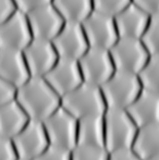
But before even all this, and before even Painter 2.0, I was advancing a secret internal tool, Texture. This was the tool used to produce nearly all of Painter's innovative textures.

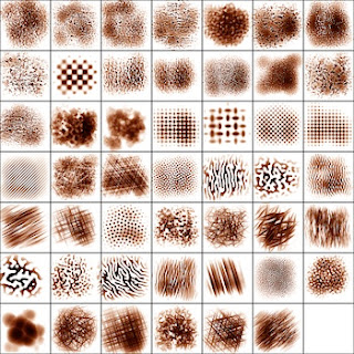
To right, you can see a test sheet with 48 textures, done in February, 1992. This showed that Texture was capable of producing speckle, z-buffered rendering, annealing, and anisotropic texture using Sequential Random Addition (coming in a future post, I promise!) even in early 1992. I recognized the need to provide textures early on, because scanning paper grain was so difficult and prone to flaws.

Right around PainterX2, Steve M hired Mary Mathis-Meltzer (now Mary Zimmer) who was the uncompromising, capable editor and manager of the manual production. She totally "got" what we were looking for and made it happen wonderfully, by building an excellent crew of designers, copywriters, and artists to make better and better (and award-winning) manuals with every revision of the product.

PainterX2, released in June 1993, was a version in between 2 and 3, that had some remarkable new features:
  • layers
  • layer palette with grouping of layers
  • brushing on layers and their masks
  • portfolio for storing layers that are used in a single project
  • editable sessions
You may have noticed that in Painter 2.0, I started building a session recording and playback feature. This was continued in PainterX2 with the ability to edit the sessions. I literally documented the format so people could drive Painter using programs they wrote.

But the really big addition to this version was layers. We called them floating selections in those days, or (unfortunately) floaters for short. John Derry came up with the Portfolio concept and I implemented it. We also pioneered grouping, painting on layers and their masks, and a palette to access the layers. This was the first commercially-available program that featured this capability.

Almost simultaneously, veteran paint system pioneer Alvy Ray Smith produced a similar capability in his revolutionary Composer program from Altamira software. His was probably working before mine, so I would say that he gets the credit. Plus, he's a lot smarter than me.

Nonetheless, Fractal Design was advancing so fast and with the professional look and the quality of our product, it all made us look a lot bigger than we actually were.

So we needed an edge to complement this. And we found one: keeping it cool.

The paint can product packaging had already put the perception of Fractal Design solidly in the cool and innovative category. With Painter 2.0, we continued that.

We needed to make sure that our corporate look was in resonance with the design community. So, John Derry and I consciously moved towards the cool side in Painter 2.0 with the So Hot So Cool campaign. You can see the artwork that John produced, reminiscent of a skateboard sticker, for Painter 2.0. A Burning Ice Cube. We also adorned the Painter 2.0 can with some of the art we compiled for this campaign.

Aside from including a burning ice cube sticker inside the Painter 2.0 can, the poster inside the can also had four renditions of a burning ice cube on it, and John and I were quite proud of our campaign. People loved our posters, and we often saw them posted on doors and office walls. For us, it was well worth the investment in word-of-mouth.

Yet, perhaps we went a bit too far. Karen Bria informed us that the east coast people weren't quite understanding the skateboard sticker theme. That perhaps it appeared to be too "California". John and I were actually amazed that they even noticed. We were happy that we could have an effect with our approach, but we learned from the event nonetheless. And never stopped creating new features.

Painter 3, released in November 1994, contained the following new features:
  • new drawer-based UI
  • frame stacks: rotoscoping video
  • onion-skinning for animation
  • the Image Hose
  • physical bristle modeling
  • multiple undo
For Painter 3, we intentionally chose a less avant-garde approach with Pour It On. Here we associated the icon of the paint can with an action that symbolized the designer's mind burgeoning with ideas: pouring their ideas onto the page (without explicitly saying or depicting it, which we considered gauche and way too literal). We intentionally packed Painter 3 with new effects as well, and we knew that such things were necessary for a designer to keep their designs fresh.

The Fractal Band singing Midnight Hour - June 1995
Shown: Laurie Hemnes (now Becker), Tad Shelby (bass),
Me (keyboard), Tim Thomas (vocals),
Mary Mathis-Meltzer (now Zimmer, vocals), and John Derry (guitar)
A lot of the newness of Painter 3 was the frame stack capability. This allow the user to import a movie, paint on every frame, or to use a movie as a close source and create rotoscoped animation using all of Painter's lifelike brushes. The Image Hose was also new in Painter 3. This allowed you to draw with life. John Derry and I used the layer masking capability to get pieces of an image, say individual clovers, masked out. Then we could apply shadows to them individually. And finally structure them so you could draw with them and produce an endless array of clover. The brush became a generator of image: a literal hose of image data. This was profoundly more valuable than texture, because it brought structure to the brush.

I also got busy implementing multiple undo, bringing Painter up to modern standards. This modification stretched over three revisions of the product, because it was so complicated.

For Painter 4, released in November 1995, our features were:
  • Shapes, so you can have layers of vector art
  • net painter
  • mosaics
  • seamless pattern tiling
  • reference layers - free transform
  • web painter - GIF and JPEG formats
The mosaic feature actually came from my earlier work in Boolean polygon operations. This is an insanely difficult problem to solve. The reference layers feature allowed layers under transfer to continue to be under transform, and consequently rotatable and scaleable. This allowed the designer to try out a lot of possibilities without committing to one. It meant that small adjustments could take place without recursive re-sampling of the image, which degrades the image over time. This can be viewed as my entry into non-destructive editing. Which, of course, was the entire concept of Altamira Composer.

Seamless pattern tiling was a useful feature for this who needed to create web pages and backgrounds that tiled in various ways. You could paint into a tile and that made it possible to produce completely seamless artistic results.

Net Painter, of course, leveraged Painter's scripting capabilities. By this time, everything done in Painter was being recorded locally to the artist's machine in real time.

When it came to marketing, we weren't running out of ideas at all. And because of the mosaics feature, we decided to play on history a bit, using the Painter Through the Ages theme. For this I created a beautiful mosaic frame for the poster, The Miracle of the Paint Can. John Derry created a beautiful image, reminiscent of Vermeer, in which Priscilla Shih (now Priscilla Cinque) posed for the image.

And the Painter Power Palette Picker was a powerful tool and an innovative bit of material to accompany the poster and the manual. That was definitely cool.

Painter 5 was released in June 1997, with the following new features:
  • impasto paint
  • liquid metal paint
  • refracting water droplet paint
  • dynamic layers - non-destructive editing (lens layers, dodge and burn layers, torn edges, etc.)
  • photo brushes
  • gooey brushes
Winter of Love 3 Poster
Artist: John Derry
Painter 5 was released approximately in sync with the merger with MetaTools, and it contained a veritable wealth of new brushes and layers. The concept of non-destructive editing was taken to the extreme by having layers you could dodge and burn into, layers that refracted the data below them, and even liquid metal layers.

Painter 5's theme was A Monument to Creativity. For this I created the Mount Brushmore image. The process of ideation for the Painter 5 logo form and ad concepts is detailed in Creativity and Painter, Part 4.

Painter 6, released in September 1999, had a set of new features that were quite brush-oriented:
  • next-generation multi-bristle brush engine
  • load brushes with multiple colors
  • leaner, clearer UI
  • life-like natural spray airbrushes
  • Interactive Image Hose, allowing changes to scale and rotation in real time
  • Painting with patterns, neon, tubes, and gradients
  • responsive palette knife
These led us to take an approach that featured brushes. Because Only Painter could do these things. This was less cool and more of a preservationist attitude. In response to products imitating Painter's capabilities. In response to Photoshop duplicating Painter's brushwork.

Painter 7 had a set of new features that I worked on as well, in the form of a consultant working for Corel:
  • liquid ink
  • watercolor version 2 (much more realistic)
  • animated absorption of pigment 
  • woodcut effect
So, the theme of producing great brushes and effects, combined with innovations like layers and interactive 3D lighting drove us to highlight the features with innovative campaigns. In each new release, we strove to maintain our creativity, and thus bolster the creativity of the artists who still choose Painter worldwide.

    Saturday, February 25, 2012

    Mess and Creativity

    Organization is important. Without it we could never accomplish any task more complicated than tweeting. We all know intuitively when sloppiness works against our productivity. But at what point does organization work against our creative minds?

    I hold that some disorganization, some mess, is required to get to a creative point. If a Rubik's cube couldn't be messed up, then it wouldn't be any fun to solve it. In fact, the messed-up Rubik's cube makes a nice symbol for intelligence in disarray.

    While the cube provides some exercise for my mind in solving it, it also suggests that we need a mess to get into an analytical state as well. Or at least to practice our analytical side.

    But the real value of mixing it up is to be presented with different things in different contexts. We night never put them together if it weren't for the mess in the first place. No, this is not about entropy and order. This is about the interconnectedness of thoughts. The complex relationships, similes, metaphors, and comparisons that our mind makes when presented with diverse options.

    Operations on Ideas

    One of my fields is imaging: pictures. When developing new imaging technologies, I come across many different techniques that apply to imaging. But the new techniques come from a specific set of operations on ideas that help me to cross disciplines and make something new.

    The first operation is deconstruction. With this technique a problem or a subject is torn apart in different ways so we can see what it's made of. With images, this can be something like moving the image into the frequency domain. Or, it can be thinking of the image as a bunch of tiles, or a mosaic. Or re-representing an image as a Gaussian pyramid. You can think of this as the analytical pre-step in being creative. The more ways you can deconstruct something, the more likely you are to find something new.

    A sculpture from Napoleon's Arc du Triomphe
    Some years ago at Fractal Design I began getting interested in extracting directions from an image: another way to deconstruct an image. This was in order to create a Van Gogh effect, that represented an image using brush strokes that were aligned to the directions of an image.

    This is as good a subject as any to introduce the next operation, random association. For something like directions, these associations are concepts like motion, velocity, vectors, maps, routes, paths, going the wrong way, a drunkard's path, alignment, perpendicular, turning the wheel, etc.

    The image processed by representing it as directions
    These ideas can lead me to look at things that aren't necessarily associated with images, like vector fields, tracing along a direction path, making directions random, canceling the randomness or uncertainty in directions, and other things that seem to be associated with directions.

    I use this to help me in branching out, another operation in creative ideation. If I move from directions to vector fields, for instance, I can then look at various properties of vector fields, like vorticity. I can also look at operations that apply to vector fields, like div, grad, and curl that I might never think of when I'm focused solely on images.

    Or, looking at direction as a velocity vector can lead me to realize that it has length and angle. Branching out from this can lead me to realize that a direction's angle can be changed. This has dramatic consequences for imaging, since it can lead to an altered reality.

    The next creativity operation is experimentation: varying the parameters.

    A picture of a tree can be quite picturesque, particularly one from the Kona coast. But when you take the directions in the image and rotate them all 40 degrees counterclockwise and mix them back into the image, you get a windswept alt-tree.

    Very different from the original. By both branching out and experimenting, I have created a new effect and it has some profound visual consequences.

    It so happens that this effect was accidentally discovered while working on something completely different (which I can't actually talk about)!

    I will show few more pictures for the visual people among my readers.

    To right you see a picture of me taken about a decade ago near the Statue of Liberty. Here I have applied maybe a fifteen-degree tilt to the directions.

    There is a little bit of windswept effect from the direction alteration. This is just what I was going for, and it is fortuitous. With the Arc du Triomphe image, the directions weren't altered in the least. But there is some uncertainty to evaluating directions and, when this effect is applied at a certain scale, you can see that the smallest details aren't always preserved. If they were, it wouldn't be interesting in the least.

    Apply this effect to clouds and make the directions perpendicular to their usual course, and you get a puffy, almost feathery, cloud.

    It's a jittery, crazy kind of reconstruction of the cloud image.

    This brings me to the last operation, which isn't really about creativity, but you can be creative about how you do it, of course: reconstruction. If you have figured out what something is made of, managed to jumble it up internally, then you can reconstruct it and hopefully not end up with Frankenstein.

    Can we apply this to another field as well as images? Of course! In music, I deconstruct songs typically so I can reflect on how they are made. Then I can randomly associate the structure of music with, say, grammar. And I can branch out from the usual song grammar to use multiple linking sections, or to precede each verse with a little prelude (I did this in my song Baby, I). Or rearrange the chords backwards and see how that sounds. I did try recording a backwards guitar part in one of my songs, and the interesting process is chronicled in another blog post.

    Or, I can deconstruct music into inter weavings of sound and silence. I can put moments of silence into a song, to create a full stop. Perhaps a fake ending, or just a de-textured rest. Yes, I used this in I Know You Know.

    I can deconstruct sound into treble, midrange, and bass and create a wall-of-sound interpretation of music. Or deconstruct vocals from instruments. Randomly associating, I can have the vocals play the instrument parts, like the Beach Boys' Brian Wilson had his band do in Help Me, Rhonda.

    One of my favorite creativity groups was the Traveling Wilburys. In Handle With Care, they changed the song structure several ways. First off, the song has 2 bridges. Then the solo comes in the fourth verse, and it's only a half-solo. The full solo comes at the end, after the repeat of the two bridges. After the fifth verse.

    The Evils of Organization?

    While organization is important to our everyday life, too much organization can also hamper us in ideation. The principle is this: if everything is in its own little box, then you simply can't imagine something that is out of the box. Is this even true?

    As impossible as it seems, even obsessive-compulsive people can make great artists. This may be because OCD leads to various interesting styles, like horror vacui. Many indications of "madness" in art have drawn us to them in the past. VanGogh and Hieronymous Bosch stand out in my mind.

    And there is a place for neat freak artists as well.

    But somewhere in between neat freaks and slobs are all the rest of us just trying to be creative and solve problems in a new way. Bringing a fresh approach to something is what it's all about. And disorder (mixing it up) is just one tool to accomplish that goal. Analysis is just as valid, and it is actually necessary for deconstruction.

    To properly deconstruct, you need to take a step back and look at your problem in a new way. For instance, looking at texture as geometry instead of pixels. Looking at stuff in different ways is really the true basis of creativity.

    Look at this video of the Traveling Wilburys Inside Out. It's just the band playing, but you can see that they took song lyrics and looked at them in different ways. Thanks to the lyrical talents of Bob Dylan and Tom Petty. And the entire subject is inverted again in George Harrison's bridge "be careful where you're walking".

    Check out my blog post on Where Do Ideas Come From to see some of these principles in practice, and the value of operating in a creative group, as the Wilburys did.

    Wednesday, February 22, 2012

    Respecting the User's Input

    I had the privilege of working at a Computer-Aided Design (CAD) company, Calma, in the late 70s, and thus I experienced first-hand the early years of computer graphics. And it was at Calma that I learned a principle that has served me well ever since: respect the user's input.

    The users of the Calma workstations used a CalComp Talos table digitizer. You would tape your sheet of VLSI artwork down on the digitizer and then you could digitize the traces (conduits of electrons on the surface of the chip you were designing) using a puck. Digitizing was a tedious process and eventually this process was eliminated by allowing the designer to build their design directly on the CAD system in the first place. Which is obvious, of course. But computers were really primitive back then and so this was a necessary stepping stone.

    It was considered massively incorrect to require the operator (what the user was called back then) to digitize a point more than once. The problem occurred so often, that the users called it double digitizing. This was clear to me, since when I wrote something, I was also its first user when testing it. And double digitizing was incredibly bad because it required extra work. And it didn't respect the user's input.

    As time went on, I became the author of the graphic editor (GED) on the Calma GDS-II system. You may not recognize this system, bit it was used to design the Motorola 68000, so you probably know its effects. GED fulfilled the promise of digitizing the geometry within the system, although it wasn't unique, and we all considered this requirement to be obvious. When I wrote it, I paid particular attention to caching the user's input so I wouldn't require anything at all to be entered twice. Even a closure point. Because by then, tablets were being used (but with wire-connected styluses) and often it was hard to hit the same point twice. So, I invented a snapping distance specifically so you only had to get close to the starting point and still specify closure.

    Constraint-based systems were still in their infancy in 1978.

    Programming

    As I did more programming, I became aware of another corollary to the principle of respecting the user's input. It was called the Perlin principle of modular programming: we hide the similarities and highlight the differences. Sometimes the similarities are simply encapsulated in classes or modules. Usually the differences become parameters to the modules, or the differences are wrapped up in the way you call the modules or use the classes. Here the user is the programmer and their input is respected in some ways because they won't have to write something twice. There is another way to respect the programmer's input: transparency. When an API (application programming interface) is complicated, then it becomes less transparent and the possibility of bugs can increase. On the other hand, when an interface is clean and well-defined, the programmer doesn't have to learn too many things, or understand the assumptions made by the writer of the API. All these things make fewer problems and also fewer chances for bugs, because the user's model of the code is very close to the way the code actually works. In this way, the programmers intent is better respected.

    MIDI

    Later on, in the late 1980s the user input became more complex. In 1988, I built a program for recording and playing back MIDI data from keyboards and drum machines. I called it MIDI '88 and it's a project that really has never seen the light of day, except for in my studio. Well, I did show it to Todd Rundgren once. And, of course, John Derry.

    To get the MIDI data, I had to interface to a driver and write an input spooler. This spooler, implemented as a ring buffer (seen to right), kept all the data around without dropping samples and events. In this way, I was respecting my input to the keyboard and allowing me to record it. I recorded the events with a millisecond-accurate timestamp. And this was the beginning of my quest to accurately preserve the user's input and faithfully reproduce the user's gestures, allowing the style of the user to come through.

    Tablets

    When I first got a Wacom tablet in 1990, I sought to do the exact same thing: create an input spooler for the tablet data, and timestamp the data accurately. But with the Wacom, there was pressure data also that needed to be captured. And then there was tilt and bearing information.

    The input spooler captured all these things.

    But I soon learned that the data I got from the tablet wasn't perfect. It didn't really accurately capture the user's input at all. One source of the error was temporal aliasing. So I learned that input data often had to be massaged.

    Some tablets had very few samples per second and others had quite a few. But, if you assumed the data from these tablets are regularly spaced, you could get kinks and ugly straight lines in your brush strokes. So I invented a limited FIFO that smoothed out these time-and-space irregularities. And I had to pay special attention to the tight turns in the path of the stylus. Changing the extrema of a brush stroke was highly undesirable since it made common actions like cross-hatching very hard. And sketching simply looked wrong if too much processing was done on the user's input. Usually, but not always, the extrema of the stylus' path was a place where velocity was at a minimum.

    But, conversely, when the stylus was moving fast, less control was exerted on the actual position of the brush. So I could afford to use parametric cubic interpolation to create more points in the brush stroke in fast-moving sections of the brush stroke. This was a good thing, because there were fewer points per inch in fast-moving sections due to the fixed sampling interval: when your hand moves the stylus faster, the sample points are spaced farther apart.

    All this made for smoother scribbling in Painter.

    When John Derry came to Fractal Design in 1992, his enthusiasm for mark-making actually meshed quite well with my desire to accurately capture the input. It made Painter a very good tool indeed for an artist for these reasons.

    We perfected the motto with respect to mark-making: to accurately capture the nuances of human expression and faithfully reproduce them, allowing the artist's style to come through.

    It is this statement that I stumble through towards the end the video in my early post Creativity and Painter, Part 1. Ah, the early days.

    Tuesday, February 21, 2012

    Disruptive Technology, Part 2

    The times, they are a-changin', and maybe it's time to change the batteries as well. In the first installment of disruptive technology, we talked about brick-and-mortar disruption by internet commerce, the disruption of books by digital media, the constant revolution in data storage, and the disruption of several markets by smartphones and tablets.

    Now we will talk about some another market currently undergoing disruption.

    Internal Combustion Engines

    Most people would think that the internal combustion engine is here to stay. This is almost certainly true because of the near-impossibility of replacing aircraft engines with anything else at present. But with cars, some leaps and bounds have occurred. And the market is beginning to see the effect of technology disruption.

    Hybrids

    Hybrids are here and are rapidly maturing as a market. The revolutionary vendor Toyota farmed out an entire market and became the Apple of hybrid vehicles with its Prius. Now most manufacturers have a hybrid car and this is increasing the average efficiency of petrochemical fuel usage. Which has been lowering the demand for three years now. But hybrids are still dependent upon gasoline. Is it possible to dispense with the petrochemical use and make a vehicle that only uses batteries?

    Electric Cars

    Electric cars do exist and are in common use already. The Chevy Volt, the Nissan Leaf, and the Tesla Roadster are examples of all-electric cars (except the Volt, which has a range-extending internal combustion engine, of course). Electric cars provide zero pollutants (and no tailpipe). The engines are quiet, and efficient, providing better acceleration than internal combustion engines. And they don't use foreign resources. So they can reduce the dependence upon an imported consumable.

    But there are issues with electric cars: maximum distance traveled, charging, acceleration, batteries, the carbon footprint of making the electricity in the first place, and of course payoff.

    Maximum Distance Traveled

    The Tesla Roadster travels 244 miles between charges, but costs $104,000. The new Tesla Model S is coming out this summer with 160 miles between charges and has an extended-range model that can go 320 miles between charges. And the price, at about $40K to $60K comes down to less than half that of the Roadster. But it has about the same acceleration capabilities.

    Other electric car offerings, such as the Chevy Volt (40 miles between charges, but with a range-extending internal combustion engine), and the Nissan Leaf (100 miles between charges) are extending the options for prospective customers.

    But the scoop is that the Volt is really more like 33 miles between charges.

    Charging

    Charging one of these cars is actually quite cheap: somewhere between $2 and $4 per "tank". That's certainly encouraging, given that a tank of gas cost me $80 this morning. Yet it took me about 4 minutes to fill up.

    But wait, how long does it take to charge these cars? On a 110-volt outlet it could take as long as 20 hours! With a 220V outlet, this goes down to 8 hours. You might be installing one of these in your garage. It's not really too foreign since your dryer has the same basic hookup.

    But the huge amount of time it takes to charge is still reducing the usefulness of these devices. I have heard of quick-charge stations; couldn't we just use those?

    Practically all of the "quick-charge" stations are in Southern California. So much for going to the gas station! Even a quick-charge to 80 percent capacity is an agonizing 30 minutes of time.

    Yet, Nissan seems to have come up with a ten-minute charging solution by changing the material of the electrode in the battery. This could be just what is needed. Or at least it's a start. And it may not appear in use for quite a while, as is typical for battery advancements.

    Acceleration

    These cars will have to be as ballsy as mine before I buy one. Well, in some cases they actually are! The Volt goes from 0-60 MPH in about 8.5 seconds, 10 seconds with four occupants. The Nissan Leaf goes from 0 to slightly over 60 MPH in 11.9 seconds. Ho hum.

    But the real surprise is the Tesla Roadster with 0-60 MPH in 3.7 seconds! And the Tesla Model S approximately matches this. So there are some more expensive options out there for those of us who like to drive fast and feel the torque.

    The improvement in acceleration was achieved by replacing lead-acid batteries with lithium-ion batteries. Now, the amount of energy per pound matters almost as much as the total amount of energy stored.

    Batteries

    The main issue with electric car batteries is how much power they can store per weight. Lead-acid batteries (used in traditional internal combustion engine cars) can store 30-40 Watt-hours per kilogram. If we use a Nickel-metal hydride battery, we can get 30-80 Watt-hours per kilogram. If we step up to Lithium-Ion batteries, though, we can get 200 and more Watt-hours per kilogram, though typical Lithium-polymer batteries are at about 100-130 Watt-hours per kilogram.

    But each of these technologies has a different issue: how many charges it can withstand before requiring a replacement. On the Tesla electric cars, a "blade" technology allows part of the batteries to be replaced in the shop on a need-be basis.

    Some new Lithium-ion battery types can withstand 7000 or more charges, which means they could practically last more than ten years.

    The idea of swapping out batteries for freshly charged batteries is a possible solution to the charging problem, and it can also alleviate the problem of the lifetime in terms of the number of charges. Then you could go to the gas station (actually a battery swapping station) and get an instant refueling. The time to refuel the batteries would then be spent in the charging stations themselves. Hmm.

    So what we need is a standard battery type that is shared between all electric cars. Right now, the battery is really one of the major advantages that each electric car vendor actually has. With the right standard (that had the right flexibility), though, the research on batteries could go on in parallel to the electric car manufacturers and improve incrementally over time. It would create a new industry.

    Carbon Footprint

    These cars are electric, right? They are totally green with no emissions! Oh, wait... where does their fuel come from?

    Really, the carbon footprint of an electric car is the footprint of the creation of the electricity used to charge the batteries again and again. So, where does your electricity come from?

    In China, the explosion in electric and hybrid cars has led to an interesting problem. It turns out that the carbon footprint of making the electricity is much worse than that of using internal combustion engines in the first place. This is because they use coal to make 70 percent of their electricity (cough).

    Payoff

    These cars will certainly pay off over time, since we won't be buying gasoline, right? It turns out that electric cars are quite expensive compared to their internal combustion and hybrid cousins. Well, the payoff probably won't be there until oil gets to about $300 a barrel.

    As for the Tesla Roaster: payoff isn't really the right word. It's about the satisfaction of driving one, I hear. Payoff is getting better for the Tesla Model S, though.

    Their recently introduced (but yet to be manufactured) Model X is more of an SUV when compared with the Model S's sedan format.

    Planes, Trains, Trucks

    The larger hauling capacity of trains and the extreme energy requirements of aircraft are in another league from the hauling and energy requirements of personal transportation. Diesel fuel, Jet Fuel, and gasoline is used for these situations because the energy density of petrochemical fuels is about 35 times the energy density of the best batteries in use with electric vehicles today.

    Currently only Hydrogen has the possibility to displace it, when compressed. But even Hydrogen uses up more space: it takes six times the volume to store an equivalent amount of Joules of energy using Hydrogen than when using gasoline.

    So, perhaps the internal combustion engine is here to stay for a while. At least for the heavy lifters of industry and travel.

    What Needs To Happen?

    Can technology overcome the problems with electric cars? To some extent and within a limited usage constraint, it has already. But to get to the point where even aircraft can practically become electric, some changes are going to have to occur.

    We need a serious advance in battery energy density. If you consider that the efficiency of the electric motor is about 75% compared with the 20% efficiency of the internal combustion engine, and if you consider the factor of 35 of energy density between the best batteries and gasoline, the energy density will have to go up by a factor of at least about 11 or 12 before we can see batteries powering Dreamliners. But is that all that's needed?

    No.

    The amount of time it takes to draw a given amount of energy from a battery must also go down, so you can increase the work temporarily for harder tasks. And the charging time will have to go down, even if battery swapping stations can become the standard.

    This means that batteries and capacitors are going to have to merge. A capacitor can be charged in very little time, hold its charge for a very long time, and discharge almost instantly. If a battery can be switched into capacitor mode, this will go a long way to improving the usefulness of batteries for driving mechanical systems that require a large amount of work.

    Monday, February 20, 2012

    Annealing

    This post talks about annealing. As I use the word, it is a process that uses iterations of a softening step and a hardening step iteratively in order to achieve an effect. This closely parallels simulated annealing, a metallurgy technique that repeatedly heats and cools metals (or simply liquifies and cools in increments).

    One reader, Stefan Wolfrum showed me how repeated sharpening and blurring can create annealing-like patterns, and I must say that I have done this before but I found it to be quite slow. This is also true with reaction-diffusion, which can require thousands of iterations to produce a result.

    So I tried it again and I found that it was a very time-consuming process. Here is the process applied to a low-resolution image of me.

    I had to repeat the process (which I implemented as a Painter script) maybe 50 times before all the areas of the image were sufficiently patterned.

    When I tried it on a larger image, I realized that this was a very ambitious undertaking indeed!

    I can take a picture in a mirror with an iPhone (with flash) and it creates interesting lens flares and striations.

    Here is the process applied to a much larger image. To complete this one took many hundreds of iterations, at the very least.

    I took the result and composited the original image over it using Hard Light to make it more obvious what the image is.

    You can see the Hawaiian honu (sea turtle) that is on my T-shirt appears in interesting detail. My hand appears to be rendered in fingerprint style.

    The flash produces striations that are rendered in multiple lines.

    And there are altogether too many wrinkles in my face!

    Notice also the oval lens flare made it into the image. Anything with a form in the image ends up getting rendered in parallel lines and windings.

    So, thanks Stefan! I like this method of annealing, but it does appear to be extremely time-consuming.

    Here is an example of quick annealing in Texture. I render a pattern using an image-in-cells texture and then filter it repeatedly. Then I anneal it to make it hard-edged. Then I return it to the FFT window and continue to filter it.

    The more it gets filtered, the more regular the lines. In this case, the filter is anisotropic.

    Once filtered a few times over (maybe four times) the image becomes the very regular fingerprint-like image you see to the right.

    The next step if to take this image back to the texture window and apply annealing to it. I adjust the anneal to create about 50% white and 50% black.

    Here, to left, you see the annealed version of the same exact image.

    But, you may ask yourself, how do I get the lines to follow he directions in an image? This would be done using direction analysis. The usual technique is to use Gabor filters (good luck implementing them).

    You can also simply load up a vector field of the directions and use that vector field to process your spotty noise texture. Anneal in-between the direction-field blur steps.

    And you can get images like these, but where the lines follow an image. However, the direction field is generally limited to the edges of the image, so you will have to infill the directions using some kind of iteration.

    For me, the next thing is to process he annealed texture into a kind of rendering of a sand dune field.

    You can see this to the right here. To get this, I used another kind o anisotropic filter that repeats all wavelengths but filters out some directions from the frequency domain image.

    This image is quite good looking as sand-dune images go.

    This technique can work, I think, on any anisotropic image.

    By the way, isotropic means without a prevailing direction, so anisotropic means with some prevailing directions. So a knitted pattern will have the direction of the knitted rows as its prevailing direction. Fabric might have  two prevailing directions.

    If you anneal an image that is filtered at a smaller wavelength (higher frequency) you get finer patterns.

    Here (to left) is an example of inner patterns.

    This technique can be used at larger scales without difficulty.


    I wanted to show you a slightly closer look at the dunes rendering. So I did another. I find the lines between the successive wrinkles to be very convincing visually. Even the slight shadings that happen when a fork occurs are nice. With all the shadings, it appears to be quite reasonable as a 3D depiction.

    As time goes on, the trick will be to get he striations to follow the lines of another image. And to do it efficiently, a better technique will have to be created.

    I do have techniques for extracting directions from images. I think a technique that allows the directions to infill areas that are generally flat will be required as well, in order to get something as cool as sharpen-blur annealing. And be efficient, of course.


    Magnitude Patterns

    Magnitude patterns arise from Fourier transforms.

    Bob Lansdon and Tom Hedges showed me magnitude patterns back at Calma in 1978. Tom had just finished a driver for the large-bed Versatec raster plotter. The plot was probably about 3 feet square and it was computed by using a 1024x1024 2D FFT of seven points evenly distributed about a circle. Bob had the program shade the magnitude of the result. FFTs work in the complex domain and by this he meant plotting for a+bi the result sqrt(a*a+b*b). Here to right you see a magnitude pattern. It is very much like a sort of puffy shape with black rivers wending and undulating through it.
    Perhaps we can see the convolutions of a human brain in it. When you notch higher frequencies, you get patterns that may include flowers, lines of beads, and really all sorts of symmetries. I got to thinking that I might be able to show the patterns more effectively, and so I decided to render the magnitude pattern to a texture and back to an FFT, moving to to the real channel of the data. Then I highpassed the result to remove the wide range of the bias. Once that  was done, I then transferred it back to a texture and annealed it to reveal all the patterns in a much higher-contrast format.
    Lines, beads, and strange patterns kind of like those we see in the convection patterns of the solar surface begin to appear.

    I really don't have any idea why these patterns are like this, save for one simple explanation. They are the magnitude patterns of a notch-filtered texture. This texture has really only one frequency of data in it, which makes it ring on only one wavelength. So the patterns are like waves on a pool with several disturbance points, all adding up to a chaotic, but highly band-limited pattern.

    Here you see the real component of the magnitude pattern at the top of this page. The dots are all in the same place, but the dark spots and the light spots in this version are both represented by light spots in the magnitude pattern. This is because the FFT, with its negative and positive values, was normalized to the black-white tonal range for display. Thus the dark spots are actually negative values and the light spots are positive. And both the negative and positive values have positive magnitude.

    So that does describe why the patterns have black rivers between them, but it doesn't say why there are higher-level patterns in the image: lines, rosettes, and chains.

    I call it happy coincidence.

    When your image has a particular kind of directionality to it, the magnitude patterns do as well.

    Here is a pattern from an image with some directionality to it. You can almost feel the sculpted surface, like some H.R. Giger style image. Dark, organic shapes.


    I was intrigued by magnitude. I took a hatching texture and annealed it into a sort of protoplasm you see to left here.

    This had the effect of generating a high-contrast image with individual randomly-shaped elements. The hatching was a nice touch since it generated protuberances on each element, kind of like cilia on a paramecium.

    Then I moved it to the FFT and did a highpass on it. The result was basically the same, but with the black and white moved to gray and the edges still visible as local contrast.


    Then I converted it to magnitude to reveal the edges as black lines on soft areas. I guess I was getting the hang of magnitude patterns. The edges of the elements become tiny black worms inside a pleasant glow. A bit like meandering rivers. I have seem the Mississippi river from the air, and it does have the same kind of undulations to it, especially down near Louisiana.
    I would like to show you some more slice-and-dice images now. I think a more proper term for these patterns is image in cell textures. Here a very large crossfade region is used for each cell, so that the cells tend to totally blend together. But of course I am also using z-buffering to merge the images together between the cells. This creates, as we have seen before, interpenetrating effects.
    Your choice of a source image can be varied for different results. Here, I just used a different part of the same source texture to get a stickery-spiny result instead of interlocking arches.

    The most interesting thing is to take these results and anneal them. Then you get some really interesting patterns. Each element can be similar to the others, but with a more organic placement and even some erosion. It becomes very natural for this reason.
    This came from a pattern that was recursively edited using slice and dice. Maybe ten times. After a while, the complexity of the individual elements is a bit like yarn. This complexity translates to even better images when you render them to very large textures.

    I think I will experiment with images that use the slice-and-dice technique using two image sources instead of only one in each cell. This will lead to areas that look one way and other areas that look in another way. Some sweaters are crocheted in patterns that vary the stitch in global ways, to create large-scale patterns. I think I will try this.

    Friday, February 17, 2012

    Texture, Part 6

    I have written of using Fourier transforms to process textures. Filtering is always more flexible in the frequency domain. Now I will give some more interesting examples of filtering, using non-isotropic filters.

    I start with a slice-and-dice texture, really a gorgeous cellular texture, created by sampling a very soft texture and placing a copy within each cell of a Voronoi tessellation. And using crossfade sets and z-buffering to mesh the edges even in curves, as you see here.

    I sampled a bright spot in the source texture, with a small dark spot immediately beneath it. I moved the source position in real time until I had the desired effect. It is fascinating to see the curves in the edges of the cells undulating in real time in response to the shifting source point. I don't think there is a real-world equivalent.

    Next I implemented a new thing for Texture: anisotropic filtering. With these kinds of filters, I limit the angle range in the frequency domain to selected angles. This makes textures that can only have certain angles of features in them.

    Here you see a soft spot filter that has been angle limited. I mentioned once before that the frequency domain representation of images must be reflection-symmetric about the origin. This defines what we can do with anisotropic filtering.

    So I processed the above image with this filter and I got quite a different texture.

    This texture is more scalloped than the above texture, but it is from the same exact source.

    The vertical lines between the cells are almost gone and the horizontal edges are accentuated. It appears to be a new kind of shading for the cells: certainly less round than the source image.

    This image becomes more like the scales on a reptile or some kind of tiered erosion.

    It is important to note that, when angle-filtering, it is important to use a soft window on the angle limiting, to avoid angular ringing.
    If I use a different filter, one with a hole in it, I am explicitly limiting the frequency range of the result in the manner of a notch filter. But it is still anisotropic, in other words: directionally biased.

    You see to left the filter I used to create the next image.

    Here we have chosen to accentuate the vertical edges between the cells, and the horizontal edges have almost completely disappeared.


    This is the result: the cells are flatter and there are shines on the vertical edges, kind of like oddly-shaped chiclets.

    With these renderings, you can almost feel the surface of the texture. Realism is a fun goal.

    But this was also exploration.

    Next I figured that, the more wavelengths I kept in, the more accurate the texture. It's the large wavelengths that define the smallest features. That's useful to know when designing filters for 2D images.

    But, even though the spot size for the filter is at a maximum, still there is an angular limitation imposed and hence the unusual shape of the filter.

    This shows the filter for the next image. You can see I kept all the wavelengths because the filter continues all the way to the edges of the square.

    And there is also a severe angular limitation, that is the tightest restriction on angular data yet shown.

    The image result is extremely detailed and sharp. It looks as if it were a pleated surface like a mattress or a down quilt.

    The crescent-shaped depressions follow the original edges of the source image's valleys. But in this case, the horizontal divisions are completely eradicated.

    The result processed image is almost squeaky clean and soapy.

    Adding Color

    I am interested in adding color to the slice-and-dice texture generator. At the very least, it could colorize each cell a little differently. It could also use a color image as the source with very little difficulty.

    Adding color to the FFT area is also possible by processing each of the channels separately. Or I could split them into YCbCr with very little extra work.

    When it comes to annealing, then color becomes problematic. Each channel may be annealed separately but there is no guarantee that it would maintain cohesion between the channels.

    With speckles, the color assigned to each speckle could be defined like with the Voronoi cells.

    Even hatching could be interesting in color, particularly the interpenetrating kind.

    I am intrigued by this possibility.

    It showed up in my notes from 1994.

    Here you see an anneal of an anisotropically-filtered texture, done at high resolution. It feels like tree bark to me.

    Many real world objects have directionality to them and clever use of anisotropic filtering can get us closer to simulating their look and feel.

    Art From Deep Inside the Psyche

    Me, 8 years before Fractal
    I must be a twisted fellow indeed. I like to draw, and I have felt this way since I was old enough to hold a pencil. I wasn't ten years old before I started drawing Evil Santa. I totally embraced counterculture when I was in my twenties. I think I started letting my hair grow and grow when I was 14, about the same time the Woodstock album set came out.

    Too bad it was all destined to fall out.

    But before that happened, I became a CEO and started a company, Fractal Design. And I guess I had to grow a responsibility. Which didn't come easy. And apparently still doesn't. But there are some things I am conscientious about: a bit of self-improvement.

    And I still like to draw.

    In the early days of Painter, I celebrated the idea of being able to paint with pixels and get the results I could get before.

    And, with every new tool I created, with every brush, I felt that my own style could expand.

    I would never have done a dumb piece like the one on the left before I became a toolmaker. But I was giddy with celebration and a little bit of pride.

    Mostly I wanted to let others in on it as soon as possible: look what I created! Hey! You can do it too.

    And I know that Kai Krause often felt the same way when working with the KPT team. Building tools and selling them was a total win-win situation for us both. And we knew it. We both liked to show off. I had the same experience with John Derry when I first saw him demoing Time Arts' Oasis at a Macworld show in Boston in 1991. I knew he felt the same as I did.

    For instance, when I created the scratchboard tool in Painter, John Derry showed me some of the better work in scratchboard, and I just wanted to do it too.

    Oh, and I just had to have my own chop mark as well.

    There is something about a left hand pointing to the right that comes from deep inside my psyche.

    But wait, I think the symbolism just flew out the window. I can't remember it now. Maybe that's what I'm pointing at!

    Anyway, my left eye is practically blind and I think this might just have led to a greater utilization of my right brain. At least in the visual centers. The ones that count.

    I like hard-edged graphics because they are visually interesting. Crisp. And you can generally resize them easily enough.

    I have mentioned my predilection for three-dimensional thinking. Back in 1995, I was toying with silk screen (John Derry and I had an industrial park suite we called the Wet Lab for working on traditional media). And I made some designs. Interlocking things.

    The first one was like a red-green-blue pixel split up into three pixels and interpenetrating.

    Kind of a pleasant simplicity, I think!

    The interesting part of silk screen to me was the separation into multiple layers for sequential screening onto a common backing. This builds up the final print. For this one, a blue layer, a red layer, a green layer, and a black layer would suffice (if you ignore the yellow background).

    My next image was more ambitious. What is it about interpenetrating three-dimensional figures? Is it just me? My convoluted psyche?

    This piece is now sporting a more realistic, less abstract form, but still with lines and even a halo. Now there is a material: wood with a nice grain.

    In fact, it looks positively carved.

    Eventually my style moved away from hard-edged graphics, but the edge remained. We'll get to that in a minute.

    This silk screen idea was implementable quite easily: you would need only four layers of screening on top of a nice white sheet of paper.

    I began thinking about how we could extract layers from a drawing and then turn it into a silk-screen look. This culminated in the Woodcut effect. But there was much more to that effect than just layers and spot colors, of course.

    Here on the right you see the beautiful layering that it takes to make this piece seamless. But on the left below you can see another piece I did.

    This one's a little more strange. In the Fractal Design days I was a developer: one of the guys. But I was also a CEO. And somewhere along the way I figured I had sold out.

    Don't get me wrong: I didn't want to sell out! But when you are part owner and on the board, you do get to feel a bit jaded about it all. And even resent the fact.

    So here I am holding my own persona as a mask. This piece was done using Detailer and I used imported 3D scan and texture-map data from the Viewpoint 3D scanner. And then touched it up in Painter.

    The head is bigger than life for a reason: I knew I was too full of myself. It's pretty easy to make fun of it all when you are in the thick of it. Sometimes that's what you need to do in order to survive.

    I had the occasion to do various pieces for print work that went into brochures and ads. Mostly we had a fantastic design crew that did these. But they humored me from time to time.

    This is a piece that I did a bit of work on. I believe I supplied the A and the h. And maybe the R. John Derry did the rest and made it into a cohesive piece. I'm pretty sure the glass i was his.

    You can certainly recognize my handiwork in the design of the A. Not unlike the interlocking blocks.

    The final piece I'll show is remarkable indeed and represents an even more troubling world view.

    That's my left hand you see there.

    I guess what I was going for was that Painter 5 was full of new brushes and all you needed was to look at your own hand to see the 5 burning reasons for buying the new release.

    It was what you could do with it.

    When I created this, I had a kind of illuminati feeling about it: like it was a symbol for a secret society.

    Also, when I was a kid, my dad had a bottle of Mercury. Yes, the liquid metal. I picked up that bottle and it was heavy. Not what I expected. And, you guessed it, I held some and rolled it around in my hand.

    I'm probably sorry I did that, because Mercury is so poisonous. But I have suffered no ill effects (save for my twisted psyche and the associated dementia).

    So I was reliving a scene from my childhood.

    And Painter 5 had a new cool liquid metal brush based on 2D metaballs. And a fire brush as well. And a great water droplet brush, creating the look at the bottom.

    All these new looks were designed to be eye-catching stuff for an ad.

    We ran that ad.

    And people got it.