Monday, May 28, 2012

Drawing On Your Creativity, Part 4

Just a small post on my birthday: a little present to you. In a world of Instagram snaps and Hipstamatic effects, actual hand work is undervalued these days, so I have sought a style for my blog posts which uses handmade illustrations. This also conveniently relieves me of the problems associated with copyright infringement.

Why Not Hand Illustrate?

All the logo work I have seen recently, for instance was done in Illustrator, a brilliant Bezier-spline-based tool for cleverly crafting the smooth edges of figures. And it has grown to be so much more, with its incredible control over negative and positive spaces. But, to me, there is a pleasure in crafting something by hand, shaping it, cleaning it up, styling it with real brush strokes, and hand-coloring it. There is so much more life in hand-illustrated artwork. Imperfection is simply part of the style.

Hand Work: Bridging the Domains

For me, hand work always starts with real paper and a real ink implement. This used to cause me some worry: worry about making mistakes, blotting out a section, making a line too thin or too fat. But I have learned to just start over until I get something which is approximately right. I use this same approach in songwriting.

The reason for the "just good enough" approach is that I can edit it later using digital means. For music, perhaps I can use ProTools, Ableton, or even GarageBand to shape the final result and re-record overdubs. For artwork, I have confidence that I can make it right using similar hand work in the digital environment. Suddenly it becomes possible to rework "permanent" ink lines and even to erase them. Work that was simply impossible in the pen-and-paper domain. Suddenly, in the digital domain, we are in the world of undo and pure unadulterated color.

I use Painter with a Wacom tablet for this work, but, of course, it can also be done in Photoshop or any paint program with good support for a tablet. I also envision doing an increasing amount of work on my iPad. In the mobile environment I use a Wacom Bamboo stylus to do my drawing. Drawing with a finger, while interesting and convenient, is a bit restrictive and inaccurate. Especially with my big fingers.

For hand-drawn traditional artwork good scanner is always important for bridging these domains, and with this comes some tonal compression and re-interpretation of the colors of the work, which is why I stick to black-and-white for my sketches. This means that simple equalization and gamma correction can convert your sketch to something that becomes useful in the digital domain.

Hand Work Entirely in the Digital Domain

OK I lied. Sometimes my hand work doesn't always start with pen and paper. This is because there is also extreme value in starting in the digital domain and staying there. In this environment you have several advantages that are not present in the pen-and-paper domain. For instance: cloning.

A specific example is shown here.

But instead of cloning, this is more to the tune of using the original as a reference.

I proceeded by opening an image captured using an iPhone. Then I cropped it to a good size and brought the smaller image into Painter.

Once there, I created five serigraphy layers using Effects:Surface Control:Serigraphy. This mimics a silk screen process, and creates layers that I can move into any priority that makes sense.

Then I collapsed all the serigraphy layers into a single layer and proceeded to rework every edge in the layer, selecting colors, redoing edges using a tiger stripe look characteristic of woodcut or linoleum cut.

I had to introduce several new shadings where there was none before.

And I am left with a self-portrait in woodcut style. I would like to say that it only took a few minutes. But in fact it took several hours. Actually, I'm still not completely satisfied. I figure about twenty hours of work should do it. But who has time for that?


Sunday, May 20, 2012

Drawing On Your Creativity, Part 3

I like to draw. I just can't help it. The process of sketching and drawing has always interested me. As with music, if I stop for a while and then start again, it all comes pouring out!

As the original author of Painter, of course, I had to study drawing from many angles. Now, when I draw, I feel a certain freedom in simply returning to the art without the burden of analysis. And I can begin to realize just why I started drawing in the first place.

Doing the Clean Line-Art Style

I keep thick pieces of standard-size paper around to sketch on, my favorite creative weapon being an ultra-fine Sharpie (retractable!). Drawing, for me, is a way to exercise my creativity.

My process for making art has been documented in this blog post series before: scan into Preview using a networked scanner, tonally adjust and crop, export to JPEG, import into Painter, clean up, resize to blog-compatible sizes using Preview again. Sometimes I will use a gel layer in Painter to colorize, particularly when I'm doing a technical illustration.

One of my styles is thus a clean, line art style with the hand-wrought look that is usually lost with Adobe Illustrator. A little like a woodcut. All of the pieces shown here were done in this manner, in the last few days. I have been practicing my implied edges: a cool form of negative space.

I like to use my desktop for most of my posts because it simplifies my process and allows me some very nice editing opportunities. I like to edit using the Wacom tablet in Painter.

Rotating the Image for Sketching

One of the reasons I like this is because I can rotate the image, making all my hand work more natural and ergonomic. In Painter, you can hold down the space bar and the option (alt) key and rotate your image by direct click-and-drag in the image. With the same keys held down, a single click restores the normal orientation. But, as I draw and clean up lines, I generally keep the drawing rotated at whatever angle most makes sense.

I learned this workflow with sketching by watching Disney artists in studio. Their old-school sketch workstations had a turnable easel. I would bet that they have something much more like Painter these days. Because I thought to migrate that workflow to the computer.

Ideation

So, I'll get an idea and ponder over how to express it in this style. When I get an idea, I like it to be one that's out of the box, not in the box.

Sometimes I will go back to the old sketches from the Painter days and I'll get an idea that I might have pursued once, but is lost to me now. And to re-examine it and explore it afresh is exhilarating. So much has been packed away. There is so much to rediscover.

Other times I will think of an idea, like Up and Down and have an internal vision for how I would like it to appear. When it intersects another of my favorite pastimes, like impossible figures, then it is settled. I begin to draw. So it's all in the perspective: how you look at it.

With Up and Down, I actually drew it a few times before I got the right shape for it.

I chose the impossible picture, with entrances going into space that simply can't exist, to make the sketch more of a personal expression, more my style.

When I was a kid, I used to have my room in the upper floor, and then later in the basement. So I know the feeling of going up and down stairs quite well, and the feelings when it changes from up to down.

I chose to let the color connote shading in this one. And the blue for sky and red for, well, the fiery depths. More allegory. Just a tiny bit of symbolism. But in my house as a kid, the upper floors had more sunlight or overcast light, which had a bluer color temperature. The lower floors had a redder light, because we used incandescents there.

In my post about iconic things, I draw several figures that derive from the concept of One. When I was drawing them, I imagined a mould that you could pour lead into that could make a three-dimensional one.

Some Technique

This is what I could envision. I just now drew it but I used a creative technique for the cross-hatching. This time, when I sketched it, I did the cross-hatching by hand. Then when I brought it into Painter, I brought each of the different directions of hatching into a separate layer so I could sculpt their shapes separately.

I tend to use a tiger-stripe technique for simulating woodcut looks. This comes from the V-shaped tool that is used to carve out linoleum and wood blocks and the shapes that they make in the blocks.

In scratchboard, a similar look is achieved. This ease of width-control was the reason I created the original scratchboard tool in Painter.

So this sketch actually comes from a six-layer image.

Iconic Patterns

I demonstrated in the iconic things post that there were speckles that didn't just use dots when you render them. The old Good'n'Plenty design. Here we have a design where there is a complete 360-degree freedom to each placed item, which is the ultimate speckle. Even the hatchings that I demonstrated before only had a 180-degree freedom to their placement.

I can imagine controlling the direction of each item by a random process, like the one I used to create the hatchings, or by using the directions from a vector field. You could create random flockings of bird-symbols in this way.

Often, in architectural renderings, random tree placement, with different sizes, is used to stylistically symbolize a grouping of trees. Sometimes this kind of pattern was used in the formica tables of the 1960s. It's worth looking up. Thinking about patterns and the way they fit together is one of those little creative things you can do.

Liquids and Different Perspectives

In a continuation of the earlier pieces here, I thought I would do more liquid stuff, because I have been doing that kind of rendering since I was young. It was always an excuse for shading, and as you may know by now, I do like to shade things.

Drops of water or oil are fascinating to me. When I was a kid, I would sometimes look at the world through the drops or rainwater on the outside of the car window. I could see the world as a microcosm of distorted figures, and back then it was a good exercise for my brain to see things from a different perspective. I love the pattern of raindrops on a windshield: the way they avoid each other, the way they coalesce, the natural pattern of their look.

Real raindrops don't actually look like these. They are really globules of liquid, and they move and wobble as they fall. Kind of like metaballs, they have a shape defined by surface tension and equilibrium. Water drops are free from many forces, when they are in flight.

I used to look at liquid mercury, and marvel at the shines. I think that reflection and refraction have always been of interest to artists' perceptions. I'm thinking Vermeer, of course.

But these liquid renderings are more about stark shading than reflections and refractions.

Rendering the quality of reflection and refraction in line art is rather complex but a laudable goal. When you hold a drop of water on your finger, I often have watched the fingerprints beneath become magnified to a huge extent, and the skin also took on an interesting glow inside the drop, due to the caustics (concentration of light by the bending of rays by refraction) created by the shape of the bead of water.

Along with a bright shine on the drop, it creates a marvelous miniature scene, allowing us to watch yet another perspective: one magnified instead of the one viewed through the car window that seems to shrink the entire world into a single drop of rainwater.

As a small kid, I was nearsighted, and so things like this would constantly be of interest to me.

Other perspectives interested me as well, as a kid.

Like the doorway. Both entrance and exit, it was the thing that kept the kids captive in the schoolroom, or kept them out. Being the guardian of in and out, a door seemed more profound to me than just a block of wood on hinges.

And, while I was at it, what made the inside in and the outside out? Why couldn't things switch? Another perspective change, quite relevant in the 1960s.

After all, I watched Star Trek, so I knew that doorways could be more than just a way in and out. A door could be a portal to another planet or even to another dimension.

So, when I tried my hand at Up and Down, initially I thought of something we were looking into directly, even with glass doors.

This is the original sketch for Up and Down. Actually, unlike the final product, it didn't really have any magic. That's when I thought about the impossible version.

It is the change of perspective that makes this kind of piece work. When you get to drawing, liquify your workflow to make your sketching smoother. And pour on the creativity!

Tuesday, May 15, 2012

Cryptography, Part 1


One of the most important methods of security are cryptosystems and their application. They are the basis for security. But in the past they have been broken notably in times of war, when necessity was at its most dire. For each post in this series, I will concentrate a bit on history and also a bit on the systems used in the modern day.

How They Work

The most obvious form of cryptography is simply the encryption of a message by a sender, sending the message in its encrypted form, and the subsequent decryption of that message by the receiver. In its original form, the message is called plaintext and the encrypted form of the message is called ciphertext. This kind of encryption has been used for thousands of years, though the methods of encryption have been getting better and better.

Letter Substitution Ciphers

Early forms of encryption were simple letter-substitution ciphers. The Caesar cipher was quite simple, just treat the letters of the alphabet as though they were a circular group and rotate the wheel. If we rotate by one, then TEMPUS FUGIT becomes UFNQVT GVHJS. This appears to be quite unreadable at first glance. But once you know the method, there are only 25 possibilities to try. Well, there should be 26, but that would include the case where the wheel was not turned. In this case the ciphertext is exactly the same as the plaintext: and so we ignore it.

A graphical example of letter substitution is Polybius' square. Here, a letter is substituted by two numerical digits, a row and a column. This makes TEMPUS FUGIT into 44 15 32 35 45 43 21 45 22 24 44. Note that the blank, or word separator, is not encoded. Yet this substitution cipher is really just an early attempt at making an ASCII representation of the characters.

If you can't encode a blank, the phrase NOW IN can be decoded as NO WIN. This is a potential misread. So the better ciphers allow for more than 25 letters, as we will see. Well, the very fact that I and J share a square seems to imply yet another kind of ambiguity would arise from the use of this cipher.

Nonetheless, letter substitution ciphers fall prey to cryptanalysis, the science of breaking a code. To break the code, all you need is a long message. The letters of a message have a very likely probability distribution: the Zipf distribution for English. So we can use frequency analysis to determine likely decodings and pretty soon we have cracked the code.

How does this work? First off, we analyze the frequency of occurrence of the ciphertext letters. Then we match that up to the frequency distribution of typical plaintext. This will give us a few likely substitutions to try.

Well, actually one more thing might be needed in practice: a list of letter pairs. Some letter pairs will be commonly-occurring and others will not occur at all. We can use this to automatically determine whether a prospective substitution is valid.

So, you see, a simple letter substitution cipher is quite insecure.

So it wasn't very long in the scheme of things that this cipher was improved on. As it turns out, simply scrambling the letters in the Polybius square is not enough to make it more difficult. This just turns it into another letter-substitution cipher.

Codes During World War I

So, what can be done to make it harder to crack? During WW I, the Germans fixed the Polybius square in two ways. First, they used a scrambled alphabet. Also they used ADFGX as the row and column numbers instead of 12345. This really only made it a bit more visually confusing, since it is still a substitution cipher.

Here you see the result of modifying the Polybius square, using letters for the row and column, and scrambling the alphabet. This is a permutation. Each message could change the code book by using a different scramble. But there was more to the key than this, as you will see.

The next step is to substitute for the letters of the message, in this case MOVE GUNS WEST is converted to AA DX XF AX XG GD GX DA FA AX DA FG.

Then we lay the encoded result into the same 5X5. Note that an X is added at the end. If the message is more than twelve letters, we do this potentially multiple times, into multiple 5X5 arrays. It is important to pad the end of the message with random text (not just X's), or it may be easier to analyze!

Then we put a 5-letter word at the top, this is the next part of the key. And this is what makes the cipher so interesting. It creates a second permutation, on the columns of the text. What we do is to sort the letters of the word, and move the appropriate columns in the array as the letters move. So this means your word can't contain the same letter twice, like TWEET, nor can it already be sorted, like ABCDE.

Once we sort the columns, we get a modified array of text. The last thing to do is to read it out in columns to produce the ciphertext.

Although this method is better than simple substitution, it is vulnerable in several ways. First, there are only 120 (5 factorial) possible sorting orders (permutations) for 5 letters. If we try them all, then there will be one ordering that gives a better frequency distribution than all the others. Even if this is not so, you can try all the orderings with likely frequency distributions, and break them using known substitution cipher attack schemes. A poor fellow named Lieutenant Georges Painvin did this by hand in 1918 and successfully broke the German code (even after they had added another row and column to their array!). It nearly drove him crazy too.

Here is the cipher text for the original message. The reason it is longer is that the result is essentially in base 5, which takes roughly twice the space in symbols vs. base 26.

What the Germans wanted was a system where they could freely transmit the message in the clear (in ciphertext form) but not have it decoded by an interloper, in their case the French. To make this work, the sender and receiver both must know the same key. This is called a shared secret in cryptography. A system where one key is used to both encrypt and decrypt the message is called a symmetric-key cryptosystem.

The advent of computers really did change cryptography. But it also simultaneously changed cryptanalysis. This is where cooler, and more mathematically-oriented, heads prevailed and systems were developed that were extremely hard to crack, even using modern computers.

Public-Key Cryptography

A fellow named William Stanley Jevons figured out that one-way functions could be applied to cryptography in 1874. This was exploited by Rivest, Shamir, and Adelman at MIT in 1977 to create the RSA algorithm.

The basic idea is that there are two keys. One, the public key, is used to encrypt the plaintext, and another, the private key, is used to decrypt it. The keys are related mathematically, but computationally it is very difficult to extract the private key from the public key.

The technique for relating the public and private key pair in RSA is factorization. It's really quite clever. The public key is the product of two large (and I mean large) prime numbers. The private key is one of the prime numbers. What makes it work is this: it is relatively easy to determine if a large number is a prime. However, when a number is not a prime, it is very hard to factor it into a product of primes.

There are many wrinkles to public-key cryptography. For instance, the protocol for key revocation or replacement is one. Timestamps can be added for additional limits on the spread and validity of the privilege of decoding.

Authentication

The main reason for the private key is, of course, the authentication of the intended receiver. But can an interloper do something to compromise the message? Absolutely. Modifying the ciphertext when it is en route from the sender to the receiver is one way to compromise the message. This gives rise to authentication schemes.

When it comes to security, it is important to have three bits of knowledge: The first is that the message is being received by its intended recipient. If you are sending a message an ally, you would like to prevent your enemy from getting it. The second is to verify that the message did, in fact, come from the origin that is advertised for the message. If your enemy sends you a message that says it comes from your friend, this can be used to deceive you. The third is to know who had the message along the way. This is akin to the chain of custody in forensics. The point is this: can you trust the message?

We now use digital signatures to authenticate messages. More on this in a future installment.


Saturday, May 12, 2012

Pieces

Pieces, the separate parts of a whole, help us understand the logical process of construction. The relationship between the pieces, such as how well they fit, help us understand the workings and character of the parts. The individual pieces limitations can bear on the capabilities of the finished product.

A cohesive design is almost always made up of separate pieces.

In a good design there are no inessential pieces: each piece is necessary for the design to be complete. Each piece does what it should and also as much as it can do.

Interrelationships Between Pieces

Also, the relationship between the pieces is key. In organization, there are requirements for one department that are produced by another department. In development, one module produces a result that is used by one or more other modules. In 
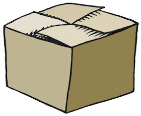
three-dimensional objects, the objects can fit together like a dovetail joint.

In a drawing, the pieces can be shaded to fully reveal their form. They can shadow other pieces to show their inter-positioning. When you see a drawing, it can make you think about how the figures in the drawing are placed, and what message is intended by the artist. In a still-life this may be of little consequence. In an Adoration of the Magi, this can be of great consequence.

Cycles

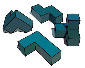
The interconnection of pieces can be cyclic, producing an induction. This cycle should be essential to the concept of the design. In programming, the loop should be essential to the working of the program, an iteration that converges on a desired result.

In a drawing, the interrelationship becomes essential to the piece as well, as indicated by this impossible triangle, copied loosely from Oscar Reutersvärd, the Swedish artist. Sometimes we can highlight something different than what was originally intended, as in this case: we indicate how the figure can be made of three L-bends that mutually depend upon each other. Impossible figures often make an excellent illustration of cyclic structures.

Also, though, looking at cycles in different ways can reveal to us more about the problem than we originally knew.

Development In Pieces

In development, we first conceive of a problem to solve and then sketch out a structure of how we will solve it. Then it helps to divide the problem into pieces. It suits us best if each piece is well-defined. We know its inputs, its results, and how it will produce them. When a piece is too complex, we can divide it up into smaller pieces.

The nature of each piece can then be worked on individually. Either sequentially by one person, or concurrently by multiple people in a workgroup. Because each piece of the problem has a different nature, this lends itself to specialization, which is suited to modern workgroups. Each piece can then be tracked separately. The interrelationship between the pieces will need to be known by the manager to properly chart the progress of the development.

Most large projects are done this way. When they are done by one person, then that person needs to understand the workings of the project as a whole, and this can lead to a huge, unmanageable situation. But not always. When a problem gets too large for one person, the pieces of the problem lend themselves to adding extra people to help, and so project division is essential to minimizing unpredictable schedules.

When Pieces Fail To Connect

When conceptualizing the division of a project into pieces, it is sometimes not possible to foresee each and every wrinkle in the workings of each of the pieces. This can lead to a situation where a piece can not be constructed or where some pieces can't be connected properly.

It is times like these when it's important to stand back, take stock of what you have learned, and integrate that into the design. Sometimes this necessitates a redivision of the project into new pieces. Sometimes the redivision only affects a few neighboring pieces. This is part of the art of project design.

Development Strategies

The pieces of a project represent the result of top-down decomposition, which usually works as a division process. Once you have a project split into pieces, and the pieces implemented, then it becomes a problem of making sure that each piece works as it should.

This entails isolation of the piece, testing its inputs, and validating its results.

In a workable system, it is essential to be able to view the intermediate results of each piece. In a graphics system, this means literally viewing them on a screen to visually verify that the result is correct. And sometimes, the ability to view each minute detail is also required.

In a system that is constructed in pieces, one problem which is presented to the authors is this: how can we add a new feature or behavior to the project. This is important because usually it is necessary to construct a simplified version of the project and then make it more complex, adding features, until it is complete.

A useful capability is this: build a simplified version of a piece for testing with the other pieces. Then, each developer can work with the entire project and flesh out their piece independently. Or, even better, a new version of the piece can be checked in, adding essential capabilities, while more complex behavior gets worked on independently.

Performing the Division

I mentioned top-down decomposition as a useful tool in dividing up a project into pieces. But this must be tempered with other considerations. For instance, the necessity that each piece do exactly what it needs to do, no more and no less. Another example is the requirement that the inner loops be as simple as possible, necessitating the factoring of extraneous and more complex cases out. This means that the subdivision must be judicious, to achieve local economy within each piece. I have been on many projects where this goal was a critical factor in deciding how to divide the problem up into pieces. This can also serve as a razor which cuts away inessential parts, leaving only a minimal interconnection of pieces.

You also want to make sure the project is organized so that, if a piece fails, we can directly verify this by turning it on and off, and seeing the result of its action and the effect of it on the entire result. This is particularly useful when each piece is a pass of the total process, like in a graphical problem, or in a compiler.

Also, it is useful to construct a test harness that contains UI so that each piece can be independently controlled, preferably with real-time adjustment. This is a great way to exercise the project. I have used this many times.

Taking Stuff Apart

Moving from development to three-dimensional construction, the disassembly process can reveal a tremendous amount about the problems encountered in producing the object, device, or mechanism. When I was a kid, I liked to take things apart. Of course, putting them back together took a bit longer.

In modern times, there are entire companies that specialize in taking gadgets apart, and even slicing open chips to reveal their inner workings. This is the process of reverse-engineering. Examples of companies that do this are chipworks.com and iSuppli.

Gadgets

I was going do do a section on gadgets and the pieces thereof, but I realized that my knowledge of such things is really not up for grabs, nor is it for public consumption.

It's really too bad since gadgets are a classic example of how each part needs to do as much as possible with as few resources as can be spared. This is one of the basic design decisions that govern the division of a project.

Often the most remote considerations suddenly become of primary importance in the division process.

Code

A friend wishes to divide up code in such a way that module authorship can be retained and the usage monitored so royalties can trickle in the proper way back to the source. Very distributed-economy. This reminds me of the App market in a way, and I'll tell you why.

In early days of software, there was much custom software that cost huge amounts of money. There were accounting systems and mainframes. These would often cost a hundred thousand dollars. The CAD systems I worked on in the 70s were very expensive as well, and specialized software, such as all-angle fracturing software, could cost plenty. It's funny how big business still maintains this model, with distributed systems still costing lots of money. This will certainly be replaced by a distributed app-based model. Some believe that the gadgets are only the front end to a giant database. This model will be replaced by the cloud model.

In the 80s, personal computers' penetration increased and software became a commodity that was sold on the shelves of computer stores. This drove the average price down to hundreds of dollars, but some software still could command up to a thousand dollars. Consider Photoshop and the huge bundles of software that have become the Creative Suite. As time went by, lots of software was forced into bundles in what I call shovelware: software that comes with too much extraneous stuff in it, to convince the buyer that it is a wonderful deal. I'm thinking of Corel Draw! in those days. Nowadays, sometimes computers are bundled with crapware, which is the descendent of shovelware.

The commoditization of software was just a step in the progress of applications. Now, applications are sold online for the most part, even with over-the-air delivery. This is because much computing has gone mobile and desktop usage is on the decrease. Many desktops have in fact been replaced by laptops, which was one step in the process.

But the eventual result was that software is now sold for a buck and the market has consequently been widened to nearly everyone.

To do this, the software had to become easier. The model for the use of the software had to become easier. The usefulness of an application had to become almost universal for this to occur and for applications to become more finely grained. Apps now sell for anywhere from free to ten bucks. But on the average, perhaps a complex app will cost a piddling two dollars.

Is it realistic for the remuneration of code authorship to also go into the fine-grained direction from the current vanguard of open-source software? Nowadays, many app authors receive royalties for their work. The market for applications has exploded and the number of app designers has also exploded: widely viewed as the democratization of programming. This is the stirring story of how app development penetrated the largest relevant market. Can the programmers themselves become democratized?

The applications of today live in a rich encomium of capabilities that include cameras, GPS, magnetic sensor, accelerometers, gyros, and so much more. For code itself to go down a democratization path, I expect that the API it lives under will have to be just as rich.

Unfortunately, the API is owned by the platforms. And even, as in the case of Java (as we have found out this last week), by the company that bought it (Oracle). Apparently an API can be copyrighted, which is a sticky wicket for Google. The vast majority of apps are written for iOS today. But, if this won't be true forever, then at least it has clearly indicated how to create an incredibly successful business model around applications. And it indicates that APIs will certainly be heavily guarded and controlled.

The spread of technology is never as simple as entropy and thermodynamics, though the concepts may certainly bear on the most profitable use case.

Either way, the democratization of code could possibly solve the litigation problem, at least when it comes to applications built on top of APIs, because the new model might in some sense replace the patent model by reducing ownership to a revenue stream, democratizing software developers. But the APIs could not be a part of this solution as long as the platform developers considered them to be proprietary.

So, in the end, I don't think system software can be a client for this model. Unless its the GNU folks.


Saturday, May 5, 2012

Iconic Things

The pursuit of simplification of a drawing or a concept is a very useful tool. You can get to the heart of an idea really quick by distilling it into its purest form. This is one dependable way in which you can tell if its a good or a bad idea.

An Iconic Knot

I was writing a blog post on knots when I began thinking about how simple a depiction of a knot could be. For me, the simplest knot is the overhand knot. I don't think a knot can be simpler than that one.

So the first thing I did was to draw it in several forms. The one I preferred was the pretzel format used by bakers in Europe. This presents it in the most readable format.

Here is my initial sketch of the overhand knot. Aside from some clumsy shading and a few thick spots, this one seemed to have the right proportions at least.

When designing a logo, the first thing is to make the figure into the simplest line art you can get away with. This meant removing the extra space of the loops (really this is tightening the knot). And it also meant losing the shading, but not the essential feeling of intertwining. So I used some tracing paper to make a crisp black-and-white version of the knot.

Here you see the second iteration of the knot. All elements of shading have been removed. The only thin lines are the ones that lead us to believe it is intertwined. The lines lead us to feel the overlap and the 3D precedence of the rope. But only that. There is nothing else left. A uniform thickness is used for the rope, and the outline is carefully moulded to give the impression of a smooth figure.

Even the place where the strands touch, in the center, has been simplified into what I believe is its simplest form. This iconic knot is a perfect stepping stone for other depictions.

For instance, I can color the knot to give it a playful design. Like the logo for a yarn company, this piece really exudes creativity and simplicity. Perfect for a crafts company.

Another possible departure from the clean logo-form is the woodcut, shown at the top. This one was inverted from the hand-colored logo form and then shading lines were cut into the form to give it a rough feeling of a linoleum cut.

For the original knot, I used a Sharpie on thick cotton bond paper, scanned it into Preview on Lion, and left it unmodified so you could see what I actually had to work with. For the logo form in black and white, I used another think piece of cotton bond paper and a sharpie to trace it. Then I scanned it into Preview and color corrected and rotated it. Then I brought it into Painter as a .jpg file and hand-edited it into the form you see here. I didn't do anything to clean up or flatten the black areas. They still had various shades of black in it from the Sharpie.

To color the second version, I used a New Layer set up with the Screen layer method in Painter. And then I drew into the black areas. The white areas are essentially left untouched by this method even if you intrude into them.

The woodcut was inverted in Painter and this produced the dirty white you see, which I liked and kept around. I added the tiger-stripe shading using lots of handwork with the goal of making it feel like a woodcut or a linoleum cut. I used my clever techniques from my scratchboard days to get the feeling right. In some cases I had to work and rework the shading stripes when they didn't fit. But I was going for an informal, hand-made look.

Iconic Forms

I like to investigate form in 3D, and the knot is certainly a way of looking at 3D forms in a new way. After all, with some slight modifications, the knot could be made into an iconic trefoil knot as well. Perhaps in my next post. A class 3D form is the cuboctahedron.

Here you see I drew a cube in perspective and then inscribed a cuboctahedron, bounded by squares and triangles. This form has 14 faces all made up of regular polygons. And since it is regularly convex, you can see seven of them here.

Shade it and you can see the form more clearly. But I think I will have to remove the lines of shading in order to simplify it more.

I love these forms. For a more complete exposition of them, see this link.

Iconic Sayings

I have noticed a lot of bands with the word One in them. In particular One Republic and One Direction, to mention just two. But it reminds me how easy it is to create iconic sayings by using the word One. As for me, I have only one eye that really works properly. But the catchphrase One Eye would not be truly great for a band. But One Vision would. Also things like One Leg would similarly not be good, being less preferable than One Step Ahead, or even One Step Behind.

In the iconic image category, One Vision leads to the all-seeing eye. This symbol, used on the dollar bill, is the symbol for vision in the larger sense. Rather than depict it as a pyramid, I have removed the third dimension and so I show it inside a triangle. Once again, it is black and white with hard edges: line art.

The eye is shiny, of course, and this is indicated by the triangular divot taken out of the iris form. The rounded form of the eye is reversed out from its triangular enclosure. Size-wise it intersects the edge and so leaves its full extent to the imagination. A clever design trick. This image may also be colored. I would suggest the iris. But this may lead to the pupil becoming colored, which will be wrong, since it must be left black. So I have left this logo form completely uncolored. Or, you can color the whole thing in a Pantone shade.

Also along these lines, the phrase One Lie occurred to me. And immediately a symbol occurred to me: a hand with the index and middle fingers crossed. Kind of a white lie, a fib.

Even such simple concepts can be iconized into a line art form, as seen here. It probably couldn't get much simpler without losing something.

Still, iconic catchphrases such as One Voice don't immediately bring an image to mind even though it is a good kernel of a thought.

Iconic Hand

The symbolic hand reaching up for help is another icon I have sought to create. I like hands, so this one seemed like a good choice.

To create the symbolism of reaching up, I wanted the hand to shadow itself and have light leak through the fingers. The light from above symbolizes hope.

The hand reaching symbolizes need, and desperation. Grasping for straws.

Here I took a photo with my iPhone, imported it directly into Preview, and saved it to a .jpg file for import into Painter. Once in Painter, i cloned it and created a line drawing. This line drawing was adjusted again and again until it seemed reasonable to my eyes. Then created a New Layer, made its layer method Gel, and used a shade of brown to add shading to the hand, using the original photo as a reference.

I did this again with a slightly redder brown, and created a darker shading layer on top. Finally, I processed the original image into a set of grainy splotches using soften and equalize. I did this repeatedly, adjusting the equalize levels so I got just the right amount of flecks of texture. Then I edited the texture image so it only covered the hand. I placed it on top as another layer and used the Darken layer method with a very small opacity to make the texture subtle enough so it wouldn't detract from the theme.

This piece is intended to be expressive, and gritty. But really only the hand form and position is iconic.

Iconic Texture

When John Derry and I used to talk about textures, one texture he liked to draw was what he called the Good 'n' Plenty texture. This was made up of lozenges placed in such a pattern so they avoided each other in a pleasing visual way.

These kinds of textures get even more interesting when the figure has a direction to it, like a triangle. So even a texture can be shown in a basic, minimalist way. The ultimate minimalist texture is the speckle, introduced and explained in the post Texture, Part 1.

Iconization

In short, the boiling down of an idea into its component parts, the exclusion of the unnecessary ones, and the most economical depiction of what's left forms the entire process of iconization. Sometimes all you have left is a silhouette. Sometimes it is a clean rendering. But always, it evokes a single iconic idea.

Iconic Bestiary - More Like This

In this blog, I have presented many iconic items. In Interlock, Part 2, I presented the iconic three intersecting rings, the atomic rings.

The post An Anatomy of Painter's Brushes, Part 3 contains a very nice iconic brush stroke, complete with grain.

In the post New Ideas, Old Ideas pretty much every picture is an iconic depiction of something.

The entire post Drawing On Your Creativity is about iconic depictions in 3D forms, many of them impossible figures.

My post on Color is filled with the iconic color overlap diagrams. Most of the figures in Interlock (the original post) are extremely iconic, and especially the Valknuts.

My post The Things We Throw Away has the iconic floating mountain.

It is clear that Art From Deep Inside The Psyche draws on all my inner troubles to produce the most interesting of all the iconic figures, some with variations, that I produced in the 90s.

My article Where Do Ideas Come From? contains a wealth of iconic imagery, from lightning bolts to letterforms.

In Patterns, Part 3 I explore the iconic looping structures and show a grammar to construct them.

In the post The Most Useful Painter Feature, the whole concept of X2 is iconized and presented in many ways.

My post on Three-Dimensional Thinking has some very clean, iconized items.

An interesting iconic item, the burning ice cube, was covered in extenso in Creativity and Painter, Part 3.