Friday, September 28, 2012

Developing a Style

In 1992, when John Derry joined Fractal Design, he introduced me to the traditional scratchboard tool. And the art of designing icons! The scratchboard tool was a tool that could scratch a thin layer of black paint off a white board. It was a very specialized traditional process, involving specially-prepared scratchboard and a special tool, like a crow-quill pen, with a changeable nib for scratching the black paint off.

In 1993, when Painter 2.0 came out, Fractal Design introduced the Scratchboard Tool to digital media. This tool had a very hard 1-pixel anti-aliased edge and also a width-changing ability that helped you create tapering lines very easily in response to pressure.

The above image is a redrawing of one of my original scratchboard sketches (then using traditional media), as depicted in Style and the Digital Era.

The scratchboard tool and its digital version pushed me to create more high-contrast art that came very close to a woodcut look. Some of my pieces from 1994 and 1995 are shown in Art From Deep Inside the Psyche.

This piece is from 1993 and shows some of my first work with Painter's Scratchboard Tool.

It also shows my Neuland Inline-inspired chop mark from that era.

It exhibits use of positive and negative space, even showing it several levels deep. Also, my preference for texture is shown in the overly-obsessive wood grain. I have cleaned this image up and colored it for display here.

You are acquainted with my modern woodcut style, having seen a few posts in this blog, and I present for you here some interesting icons I sketched in 1999 but have now completed in this style. This set of icons is the Disasters of Nature set.

Here is the "Earthquake" icon. Really the ground doesn't crack open in an earthquake, though! Why is it that most earthquakes seem to happen on bright cheerful sunny days? Because I have only been in an earthquake in California, thats why!

Yes, I was here for the 1989 earthquake, a 7.1 on the Richter scale. Although it was known as the San Francisco quake, it's actual epicenter was in Aptos, about 5 miles from where I lived, in the forest of Nisene Marks.

My friend Tom Hedges was actually hiking in that very forest when the earthquake hit! He said the trees shook and a huge amount of pollen and chaff came down from them.

The next is the "Wildfire" icon. A raging fire is another disaster, particularly here in California where every summer and autumn the fires come very close to homes.

There have even been some terrible fires close to my home, some as close as a half-mile.

You see, earthquakes strike without warning, and quickly start moving. It's really unnerving. Wildfire is also terrifying, because you can see it coming closer. Our firefighters always do their best and always contain them, but sometimes there is no way to prevent them from burning our homes.

California forests are all about renewal. After a fire, the wooded area grows back.

Lightning is another disastrous force of nature that can have devastating effects. Living near the coast, we find that many weather systems traveling frictionless over the ocean will suddenly release their energy quite close to us, as they reach land. This means torrential rain and, occasionally, lightning.

Such a powerful electrical discharge is really a grounding of the enormous potential energy stored in storm cloud systems.

A particularly strong lightning strike can easily possess a hundred thousand amps of current.

Humankind cannot yet duplicate the voltage and current of lighting, evidence that we still have a ways to go.

A hurricane icon depicts a fierce wind, blowing trees over and flooding with its massive overpowering storm surge waves.

Typhoons and hurricanes cause incalculable damage, sometimes flooding huge areas of cities, like New Orleans' Ninth Ward.

Although hurricanes never attack California north of the tip of Baja California, we do get some heavy weather here. Trees have been known to fall in the heavy weather.

And lightning has been known to strike the field outside my house as well, splitting trees from time to time. This is the consequence of living near the coast.

Tornados are a major destructive force of nature! Their winds lift objects weighing tons and throw them through the air, leaving a path of destruction sometimes a half-mile wide, like a scar on the earth.

The US is famous for its "tornado alley" stretching from Abilene to Fargo where one week can sometimes see hundreds of tornadoes.

I have seen a tornado in Japan. I was driving back from Hakone to Tokyo and one appeared less than a mile to my left. At one point it struck a lake and turned into a shiny silver waterspout. I was in no danger because the terrain was a bit mountainous and its vortex was trapped in a little valley while I drove by.

I will get back to these icons in the future, because it's clear that I have forgotten avalanches and volcanoes, both of which I have first-hand knowledge!


Saturday, September 22, 2012

Three-Dimensional Design

It takes awhile for a design to unfold in my mind. It starts with a dream of how something can best function, and, with real work, iterates into the optimal form for that workflow. Yet it's not until it assumes real form that I can say whether I'm satisfied with it.

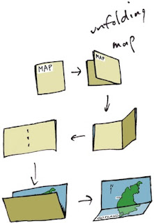
When designing, I often consider the benefit of workflow I have experienced in the past. Consider maps. When I was a kid, driving across the US in summer, I collected maps from gas stations (back when they still had them). I was trying to collect a map for each state. This is when I became familiar with the basics of functional design. A map had to be compact, and yet describe many places with sufficient accuracy for navigation.

I observed how both sides of a map were useful for different purposes. How many locations of interest were indicated with icons. A legend indicated what the icons meant. This was a time of real curiosity for me. Of essential discovery.

Such hobbies as building geodesic domes and technical illustration kept me focused on function for the longest time. But eventually, in high school, I discovered Graphis, an international magazine of graphic design. This struck a chord with my innate drawing talents. And suddenly I was also focused on form.
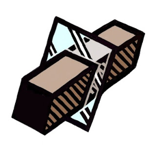
And then it was impossible function that caught my eye. At Fractal Design, I continued this design philosophy. Here is an illustration from those days, reinterpreted in my modern style that expresses form. A wooden block penetrates through glass. This is ostensibly impossible, of course, but it was in tune with my sense of materials and their simulation in UI.

At the time, I was lost in a maze of twisty passages, all alike: the labyrinth of UI design.

John Derry and I were concentrating on media, and had been since Dabbler introduced wooden drawers into paint program interfaces. Like the paint can, it was a return to the physical in design. Interfaces needed something for users to conceptually grab onto: a physical connotation that made the interface obvious to the user.

One project I was developing at the time was Headline Studio. This was an application specifically intended to create moving banners for web ads. It concentrated on moving text. So when working on a hero logotype, I sketched out these letters. The idea was that, in a static illustration, the letters might appear to be walking in. And the addition of the cursor was a functional cue. This ended up being pretty much what we used.
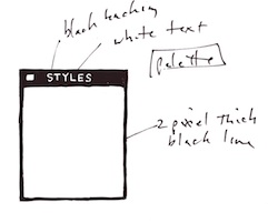
Every bit of Headline Studio was designed in minute detail. This included many designs that were not used. For instance, I show here a palette that was rejected because it was thought to be too dark.

This brings up the subject of visual cues. To visually cue the user to thinking of a palette as something to adjust the image, we chose simpler designs that those we used for windows. But sometimes we went overboard on palettes, as you know from the Painter UI design.

In the Headline Studio timeframe, we started thinking about three-dimensional UI. We considered different three-dimensional functions. For instance, we considered the window shade.
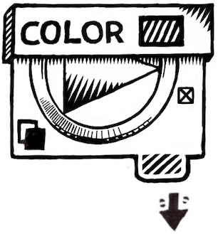

A window shade is hidden when you want to see out, and you pull it down when you want to block the view. At the time, there was a trend to make a window collapse to just its title bar when when you double-clicked it there. I considered that to be an extension of the window shade.

And by extension, we could turn palettes into window shades so their controls could be accessed only when they were needed.

Eventually this technique was replaced by the expanding list with the disclosure triangle. We liked this because when the list was closed, certain crucial data could be displayed in the list element. The user could thus discover the current state of the most important controls in a quick glance, even when the list was closed.

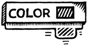
You get a bit of that here where the current color is displayed even when the palette is rolled up.

And like a real window shade, a small amount is shown to grab and slide down. This sort of technique would work even now in the multi-touch era.

You can also see a nod to the three-dimensional look, because the palette bar has depth. This makes it more sensible to the user that it can somehow contain the rolled-up shade.
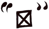
The real cost of producing a three-dimensional UI is the need to develop an visual language of controls. Take for example the humble check box.

It has been a box with an X, a box with a check coming out of it, even a simple bump that becomes a different-colored indentation. Eventually the box with the X became a close square in a typical window (though Mac OS X uses little colored balls. Which really are very nice, I think. The close ball uses an X, of course).
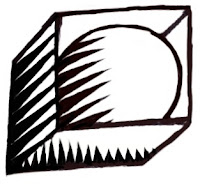
But the check box is really an on-off item. It could easily be a ball in a box that just changes color when you tap on it, for instance. On and Off? Red and Green? Or it could be a 1 and a 0.

You become endlessly mired in an array of choices when it comes to this necessary visual language. And some things just don't make sense. Eventually we came to the conclusion that objects were more useful than icons. Because the objects become more readable and their behavior is already known.

When we came to sliders, we realized that they were also used as visual indicators. Having played a pipe organ from time to time when I was a teenager, I found that drawbars might make a nice physical metaphor.
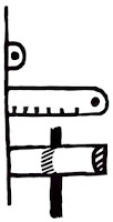
Here is a prototype for the actual sliders themselves. One of the metaphors used was like a ruler with a dot at the end. This dot marked a grab-point. You could tap and grab at that location to extend the slider to the right. This would increase its value. The marks at the bottom give you an indication of the magnitude of the slider's value. Another more drawbar-like metaphor is the glass semicylindrical rod. You can see its magnitude based on the number of lines you cross (and which refract into the rod as you drag them over).

This was an example of form leading function, but it was compelling enough to experiment with. If you turn this one into a real control, it must be possible to have several of them, like drawbars on an organ.
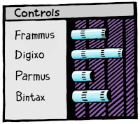
Another way to look at them is as a bar chart. Each parameter has a magnitude that is indicated by the length of the glass rod. The interface is three-dimensional, as you can see. The section to the left of the bars is thick enough for the bars to be embedded into.

Probably the inclusion of even more shadows would make it visually more interesting and also more easy and obvious to interpret.

These are re-drawings of my original sketches from 1999, colored and rendered using a woodcut look.
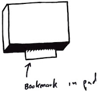
The idea of using a sticky note that sticks out of the edge of a three-dimensional pad was one simple physical construction that seemed useful. But how? In real life it is used to mark a place. Sometimes it is used to specify where in a large document you need to sign.

Either way, it was similar to a bookmark in the web: a quick way to get back to a specific place that you want to remember

The pad signifies a multi-page document, like a PDF. So, how might this be envisioned in actual use? I actually drew out a few examples. And here is one.

This shows an idea for a storyboard project. The storyboard is the multi-page document, with frames showing in sequential order. Different scenes might be marked using colored tags. The blue arrows allow the user to sequence through the pages in the normal linear ordering.

Probably the colored tags would live in small piles like a sticky pad. The user can click and drag a sticky note from the pad to tear one off and continue to drag the note to the document for use as a placeholder on the current page.

A nice, clean three-dimensional interface for non-linear access to a linear document!
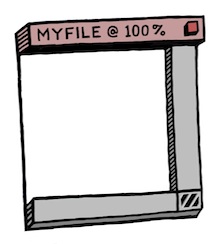
Here's another three-dimensional interface, used for a document window. It's kind of a gratuitous use of 3D though, as you can see. Still, it features an infinitely thin document, like paper, stretched in a frame made up of the scroll bars and the title bar.

Perhaps the red item in the corner is a close box.

Down in the corner is a kind of tactile device used for adjusting the window size. All of these parallel what a window has in it right now, of course, and has always had in it.

It's all about using a different visual language for the UI elements, which is something you have to choose before developing a UI in general.

Here is another, more generic example, devoid of the accoutrements of a title bar. It shows that it might be possible to put transparent stuff into an interface as well.

It is unlikely that I had any idea why I wanted a transparent element in the interfaces (I have colored it green to single it out). It is another example of form leading function.

I am still interested in how such an element can be used, though. It does look cool. It is also possible to make the document itself transparent. This might even be a nice frame for a layer in a touch environment. Consider touching the layer, and then having some controls appear around it. In this case, the three-dimensional interface makes more sense since they are like objects that appear on touch command.
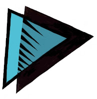
But you can consider elements like the blue arrows in the storyboard example above. They could be made transparent easily, with no real loss of readability. And that would look cool as well.

And what, I wonder, is the shadow being cast on? The elements seem to float in space in the example. It is an example of a visually interesting impossibility. If we were going for true realism, this wouldn't qualify.

And that, in a nutshell, is one of the endearing qualities of three-dimensional UI. It doesn't have to simulate something totally real. It can be magic, simply transcending reality.

The amazing thing is that, as a user, you still get it.
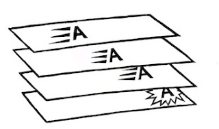
When it came to the Headline Studio packaging, I needed to come up with a way of showing animation on the box: a completely non-moving way of showing animation. I came up with several ideas, but this one stuck in my mind as a good way to show it.

Once again, three dimensional design becomes a useful tool, because it helps to replace the missing dimension of time.

Sunday, September 16, 2012

Why I Like to Draw


Drawing seems like something that is just built in. When I want to visualize something, I just put pen to paper. But why do I like to do that?

It exercises my creativity, for one. And my right brain needs a bit of exercise and use after doing programming all day. But it's more than just exercise I seek.

I also seek to bring what I see inside into some kind of reality. I like the interrelationships between the spaces I see. Positive space and negative space. Three-dimensional space. Containment. Folding. Entrances and exits. Liquid spaces.

All these qualities are enfolded into a single unit: the illustration. I feel there should always be more than one way to look at it because is multi-sided.

It Starts With Media

I have been drawing for quite a while. But I think I learned most of my craft in early grade school. When I went into High School, as a freshman, a friend and I took an advanced Art class and this is when I started drawing ever more ambitious projects. Mostly I worked in felt pen, which suits me even now, since I have been using Sharpie on thick white paper as my main medium. Or at least my main traditional medium.

But I also liked to use pencil. I bought Faber Castell Ebony pencils and thick, rough paper.

It's really this medium that got me started on Painter in 1990. I loved the rough grain and the progressive overlay of strokes to create shading. Shading brought out the spaces I could see in my mind, and made then into real objects.

My main medium has become something quite different now. It is Painter.

Disrupting the Art World?

What happened when Painter was introduced? Well, there were a lot of artists who didn't need to go to art stores any more. This was a form of disruption, I think. But I doubt that art stores will go away any time soon. The traditional media are still quite compelling. And they are probably the quickest way to learn.

Yet disruption is like chopping off the golden tip of the pyramid and walking away with it. The old one crumbles slowly, having lost its luster, and the new one becomes a smaller, faster, better version of the old. And because it's mobile, you can have it in your hand rather than having to go out to the old brick-and-mortar to see the pyramid. In the digital world, this is like digital delivery: you can read the book on your iPad without having to go to the library or bookstore. The advantages are easy to see.

In the same way, Painter has all but eliminated my need to buy pencils. The Ebony pencils I own are ten years old at least.

The Mechanics of Replacing Traditional Styles

I learned to shade in Painter, using one of my first creations, the Just Add Water brush. I would apply colored pencils, which gave me a varied color with grain. In a shade that wasn't too primary. And then I would use the Just Add Water brush and smooth it out into a cohesive shading, like watercolors.

Recently I have taken to a woodcut-like shading technique. It's a bit like engraving. Usually black lines delineate the subject and the shading is applied in a manner similar to the way a linoleum-cutting tool works.

In Painter, I sculpt each of these shading lines separately, often going over the edge of it five or six times.

Drawing From the Mind

But the main thing for me is the form I am drawing, like a two-dimensional sculpture. Many times a drawing is really a projection of a three-dimensional concept onto a two-dimensional surface.

To enhance the rendering, I sometimes employ a "watercolor overlay", which is a layer with a Gel composite method. I can draw into this layer to add color to the illustration. I can use Just Add Water to soften the edges of a color change.

While traditional media are still the easiest way to learn illustration, Painter may be the easiest way to experiment with different media.

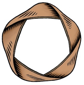
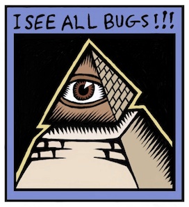
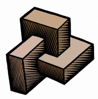
Most of my recent illustrations concentrate on three-dimensional relationships. The letter A with some depth, but hand-wrought. Interconnected boxes. A pyramid with an eye in it. Some of these are new versions of my older sketches. But all of them feature some overlap, folding, interlock, or holes.

Take for example this piece. Two S-shaped pieces of rebar interconnect, showing a very small weaving. There is over and under, interlock, shadows, and also shading. It's all tied up in the way I think about things, and what I find interesting.

I draw because I want to show what I'm thinking about. I want to freeze the thoughts and make then concrete.

And the way the illustration interweaves with my text is also quite important. Sometimes the drawing gives me ideas, and even defines the discourse.

Sometimes drawing can be like solving a puzzle to me. I must figure out where the pieces have to go before I can compose them properly. Painter saves me because in the digital world I can draw construction lines and totally erase them afterwards. Or I can draw crudely and then rework edges to make them straighter after the fact. The digital medium is extremely malleable. It has changed the habits of artists since Painter came out. Features like mixed media all in one package, undo, and perfect erase make the digital medium the ideal place to try stuff out for your next illustration.

Inspiring Sources

When I draw, it is therapeutic to me. And the good thing is to produce something you can look at.

The style I choose is a bit like engraving, as I have mentioned. These are inspired in part by the Flora Danica prints and illuminated manuscripts.

Chet Phillips, who has inspired me by his creativity, also likes to use the scratchboard-watercolor style. His imagination in creating characters seems to be unparalleled. And much like in the old work of Fractal Design, old items are repurposed in style and substance to make new fantasies of illustration and storytelling. He even uses magically-transformed packaging to build his works.

More Than an Illustration

The whole package, extending illustration into more than just pictures, is also why I like to write. While an illustration can leave me hanging by a thread when I look at it, a full-blown explanation can cinch the knot tight around your subject and create an artful connection to the reader's mind.


Sunday, September 2, 2012

Keep Adding Cores?

There is a trend among the futurists out there that we just need to keep adding cores to our processors to make multi-processing (MP) the ultimate solution to all our computing problems. I think this comes from the conclusions concerning Moore's Law and the physical limits that we seem to be reaching at present.

But, for gadgets, it is not generally the case that adding cores will make everything faster. The trend is, instead, toward specialized processors and distribution of tasks. When possible, these specialized processing units are placed on-die, as in the case of a typical System-on-a-Chip (SoC).

Why specialized processors? Because using some cores of a general CPU to do a specific computationally-intensive task will be far slower and use far more power than using a specialized processor specifically designed to do the task in hardware. And there are plenty of tasks for which this will be true On the flip side, the tasks we are required to do are changing, so specific hardware will not necessarily be able to do them.

What happens is that tasks are not really the same. Taking a picture is different from making a phone call or connecting to wi-fi, which is different from zooming into an image, which is different from real-time encryption, which is different from rendering millions of textured 3D polygons into a frame buffer. Once you see this, it becomes obvious that you need specialized processors to handle these specific tasks.

The moral of the story is this: one processor model does not fit all.

Adding More Cores

When it comes to adding more cores, one thing is certain: the amount of die space on the chip will go up, because each core uses its own die space. Oh, and heat production and power consumption also go up as well. So what are the ways to combat this? The first seems obvious: use a smaller and smaller fabrication process to design the multiple-core systems. So, if you started at a 45-nanometer process for a single CPU design, then you might want to go to 32-nanometer process for a dual-CPU design. And a 22-nanometer process for a 4-core CPU design. You will have to go even finer for an 8-core design. And it just goes up from there. The number of gates you can place on the die goes up roughly as one over the square of the ratio of the new process to the old process. So when you go from 45 nm to 32 nm, you get the ability to put in 1.978x the number of gates. When you go from 32 nm  to 22 nm, you get the ability to put in 2.116x as many gates. This gives you room for more cores.

A change in process resolution gives you more gates and thus more computation per square inch. But it also requires less power to do the same amount of work. This is useful for gadgets, for whom the conservation of power consumption is paramount. If it takes less power, then it may also run cooler.

But wait, we seen to be at the current limits of the process resolution, right? Correct, 22 nm is about the limit at the current time. So we will have to do something else to increase the number of cores.

The conventional wisdom for increasing the number of cores is to use a Reduced Instruction Set Computer (RISC) design. ARM uses one, but Intel really doesn't. The PowerPC uses one.

When you use a RISC processor, it generally takes more instructions to do something than on a non-RISC processor, though your experience may vary.

Increasing the die size also can allow for more cores, but that is impractical for many gadgets because the die size is already at the maximum they can bear.

The only option is to agglomerate more features onto the die. This is the typical procedure for an SoC. Move the accelerometer in. Embed the baseband processor, the ISP, etc. onto the die. This reduces the number of components and allows more room for the die itself. This is hard because your typical smartphone company usually just buys components and assembles them. Yes, the actual packaging for the components actually takes up space!

Heat dissipation becomes a major issue with large die sizes and extreme amounts of computation. This means we have to mount fans on the dies. Oops. This can't be useful for a gadget. They don't have fans!

Gadgets

Modern gadgets are going the way of SoCs. And the advantages are staggering for their use cases.

Consider power management. You can turn on and off each processor individually. This means that if you are not taking a picture, you can turn off the Integrated Signal Processor (ISP). If you are not making a call (or even more useful, if you are in Airplane Mode), then you can turn off the baseband processor. If you are not zooming the image in real time, then you can turn off the a specialized scaler, if there is one. If you are not communicating using encryption, like under VPN, then you can turn off the encryption processor, if you have one. If you are not playing a point-and-shoot game, then maybe you can even turn off the Graphics Processing Unit (GPU).

Every piece you can turn off saves you power. Every core you can turn off saves you power. And the more power you save, the longer your battery will last before it must be recharged. And the amount of time a device will operate on its built-in battery is a huge selling point.

Now consider parallelism. Sure, four cores are useful for increasing parallelism. But the tendency is to use all the cores for a computationally-intensive process. And this ties up the CPU for noticeable amounts of time, which can make UI slow. By using specialized processors, you can free up the CPU cores for doing the stuff that has to be done all the time, and finally the device can actually be a multitasking device.

Really Big Computers

Massive parallelization does lend itself to a few really important problems, and this is the domain of the supercomputing center. When one gets built these days, thousands, if not millions, of CPUs are added in to make a huge petaflop processing unit. The Sequoia unit, a BlueGene/Q parallel array of 1,572,864 cores is capable of 16.32 petaflops.

But wait, the era of processing specialization has found its way into the supercomputing center as well. This is why many supercomputers are adding GPUs into the mix.

And let's face it, very few people use supercomputers. The computing power of the earth is measured in gadgets these days. In 2011, there were about 500 million smartphones sold on the planet. And it's accelerating fast.

The Multi-Processing Challenge

And how the hell do you code on multi-processors? The answer is this: very carefully.

Seriously, it is a hard problem! On GPUs, you set up each shader (what a single processor is called) with the same program and operate them all in parallel. Each small set of shaders (called a work group) shares some memory and also can share the texture cache (where the pixels come from).

It takes some fairly complex analysis and knowledge of the underlying structure of the GPU to really make any kind of general computation go fast. The general processing issue on GPUs is called the GPGPU problem. The OpenCL language is designed to meet this challenge and bring general computation to the GPU.

On multiple cores, you set up a computation thread on one of the cores, and you can set up multiple threads on multiple cores. Microthreading is the technique used to make multiple threads operate efficiently on one core. Which technique you use depends upon how the core is designed. With hyperthreading, one thread can be waiting for data or stalled on a branch prediction while the other is computing at full bore, and vice-versa. On the same core!

So you need to know lots about the underlying architecture to program multiple cores efficiently as well.

But there are general computation solutions that help you to make this work without doing a lot of special-case thought. One such method is Grand Central Dispatch on Mac OS X.

At the Cellular Level

There is a multi-core architecture that is specifically a massively-parallel model that departs from simply just adding cores. The Cell Architecture does this by combining a general processor (in this case a PowerPC) with multiple cores for specific hard computation. This architecture, pioneered by Sony, Toshiba, and IBM targets such applications as cryptography, matrix transforms, lighting, physics, and Fast Fourier Transforms (FFTs).

Take a PowerPC processor and combine it with multiple (8) Signal Processing Engines capable of excellent (but simplified) Single-Instruction Multiple Data (SIMD) floating-point operations, and you have the Cell Broadband Engine, a unit capable of 256 Gflops on a single die.

This architecture is used in the Sony Playstation. But there is some talk that Sony is going to a conventional multi-core with GPU model, possibly supplied by AMD.

But what if you apply a cellular design to computation itself? The GCA model for massively-parallel computation is a potential avenue to consider. Based on cellular automata, each processor has a small set of rules to perform in the cycles in between the communication with its neighboring units. That's right: it uses geometric location to decide which processors to talk with.

This eliminates little complications like an infinitely fast global bus, which might be required by a massively parallel system where each processor can potentially talk to every other processor.

The theory is that, without some kind of structure, massively parallel computation is not really possible. And they are right, because there is a bandwidth limitation to any massively parallel architecture that eventually puts a cap on the number of petaflops of throughput.

I suspect a cellular model is probably a good architecture for at least two-dimensional simulation. One example of this is weather prediction, which is mostly a two-and-a-half dimensional problem.

So, in answer to another question "how do you keep adding cores?" the response is also "very carefully".