
What is better? Bigger pixels or more megapixels? In this blog post, I will explain all. The answer may not be what you think it is!
Image sensors
Digital cameras use image sensors, which are rectangular grids of
photosites mounted on a chip. Most image sensors today in smartphones and digital cameras (intended for consumers) employ a
CMOS image sensor, where each photosite is a photodiode.
Now, images on computers are made up of pixels, and fortunately so are sensors. But in the real world, images are actually made up of
photons. This means that, like the rods and cones in our eyes, photodiodes must respond to stimulation by photons. In general, the photodiodes collect photons much in the way that our rods and cones integrate the photons into some kind of electrochemical signal that our vision can interpret.
A photon is the smallest indivisible unit of light. So, if there are no photons, there is no light. But it's important to remember that not all photons are visible. Our eyes (and most consumer cameras) respond only to the
visible spectrum of light, roughly between wavelengths 400 nanometers and 700 nanometers. This means that any photon that we can see will have a wavelength on this range.
 Color
Color
The light that we can see has color to it. This is because each individual photon has its own energy that places it somewhere on the electromagnetic spectrum. But what is color, really? Perceived color gives us a serviceable approximation to the spectrum of the actual light.
Objects can be colored, and lights can be colored. But, to determine the color of an object, we must use a complicated equation that involves the spectrum of the light from the light source and the absorption and reflectance spectra of the object itself. This is because light can bounce off, be scattered by, or transmit directly through any object or medium.
But it is cumbersome to store light as an entire spectrum. And, since a spectrum is actually continuous, we must sample it. And this is what causes the approximation. Sampling is a process by which information is lost, of course, by
quantization. To avoid this loss, we convolve the light spectrum with color component spectra to create the serviceable, reliable color components of
red,
green, and
blue. The so-called
RGB color representation is trying to approximate how we sense color with the rods and cones in our eyes.
So think of color as something three-dimensional. But instead of X, Y, and Z, we can use R, G, and B.
Gathering color images
The photons from an image are all mixed up. Each photodiode really just collects photons and so how do we sort out the red photons from the green photons from the blue photons? Enter the
color filter array.

Let's see how this works.
Each photosite is really a stack of items. On the very top is the
microlens.
The microlenses are a layer of entirely transparent material that is structured into an array of rounded shapes. Bear in mind that the dot pitch is typically measured in microns, so this means that the rounding of the lens is approximate. Also bear in mind that there are millions of them.

You can think of each microlens as rounded on the top and flat on the bottom. As light comes into the microlens, its rounded shape bends the light inwards.
The microlens, as mentioned, is transparent to all wavelengths of visible light. This means that it is possible that an infrared- and ultraviolet-rejecting filter might be required to get true color. The colors will become contaminated otherwise. It is also possible, with larger pixels, that an anti-aliasing filter, usually consisting of two extremely thin layers of silicon niobate, is sandwiched above the microlens array.

Immediately below the microlens array is the color filter array (or CFA). The CFA usually consists of a pattern of red, green, and blue filters. Here we show a red filter sandwiched below.
The CFA is usually structured into a Bayer pattern. This is named after Bryce E. Bayer, the Kodak engineer that thought it up. In this pattern, there are two green pixels, one red, and one blue pixel in each 2 x 2 cell.

A microlens' job is to focus the light at the photosite into a more concentrated region. This allows the photodiode to be smaller than the dot pitch, making it possible for smaller fill factors to work. But a new technology, called Back-Side Illumination (BSI) makes it possible to put the photodiode as the next thing in the photosite stack. This means that the fill factors can be quite a bit larger for the photosites in a BSI sensor than for a Front-Side Illumination (FSI) sensor.
The real issue is that not all light comes straight into the photosite. This means that some photons are lost. So a larger fill factor is quite desirable in collecting more light and thus producing a higher signal-to-noise ratio (SNR). Higher SNR means less noise in low-light images. Yep. Bigger pixels means less noise in low-light situations.

Now, the whole idea of a color filter array consists of a trade-off of color accuracy for detail. So it's possible that this method will disappear sometime in the (far) future. But for now, these patterns look like the one you see here for the most part, and this is the Bayer CFA pattern, sometimes known as an RGGB pattern. Half the pixels are green, the primary that the eye is most sensitive to. The other half are red and blue. This means that there is twice the green detail (per area) as there is for red or blue detail by themselves. This actually mirrors the density of rods vs. cones in the human eye. But in the human eye, the neurons are arranged in a random speckle pattern. By combining the pixels, it is possible to reconstruct full detail, using a complicated process called
demosaicing. Color accuracy is, however, limited by the lower count of red and blue pixels and so interesting heuristics must be used to produce higher-accuracy color edges.
How much light?
It's not something you think about every day, but the
aperture controls the amount of light let into the camera. The smaller the aperture, the less light the sensor receives. Apertures use f-stops. The lower the f-stop, the larger the aperture. The area of the aperture, and thus the amount of light it lets in, is proportional to the reciprocal of the f-stop squared. For example, after some calculations, we can see that an f/2.2 aperture lets in 19% more light than an f/2.4 aperture.
Images can be noisy. This is generally because there are not enough photons to produce a clear, continuous-tone image, and even more because the
arrival time of the photons is random. So, the general rule is this: the more light, the less noise. We can control the amount of light directly by increasing the
exposure time. And increasing the exposure time directly lets more photons into the photosites, which dutifully collect them until told not to do so. The randomness of the arrival time is less a factor when the exposure time increases
Once we have gathered the photons, we can control how bright the image is by increasing the
ISO. Now, ISO is just another word for gain: a volume knob for the light signal. We crank up the gain when our subject is dark and the exposure is short. This restores the image to a nominal apparent amount of brightness. But this happens at the expense of greater noise because we are also amplifying the noise with the signal.
We can approximate these adjustments by using the sunny 16 rule: on a sunny day, at f/16, with ISO 100, we use about 1/120 of a second exposure to get a correct image exposure.

The light product is this:
(exposure time * ISO) / (f-stop^2)
This means nominal exposure can be found for a given ISO and f/number by measuring light and dividing out the result to compute exposure time.
If you have the exposure time as a fixed quantity and you are shooting in low light, then the ISO gets increased to keep the image from being underexposed. This is why low-light images have increased noise.
Sensor sensitivity
The pixel size actually does have some effect on the sensitivity of a single photosite in the image sensor. But really it's more complicated than that.
Most sensors list their pixel sizes by the
dot pitch of the sensor. Usually the dot pitch is measures in microns (a micron is a millionth of a meter). When someone says their sensor has a bigger pixel, they are referring to the dot pitch. But there are more factors affecting the photosite sensitivity.
The
fill factor is an important thing to mention, because it has a complex effect on the sensitivity. The fill factor is the amount of the array unit within the image sensor that is devoted to the surface of the photodiode. This can easily be only 50%.
The
quantum efficiency is related to the percentage of photons that are captured of the total that may be gathered by the sensor. A higher quantum efficiency results in more photons captured and a more sensitive sensor.
The light-effectiveness of a pixel can be computed like this:
DotPitch^2 * FillFactor * QuantumEfficiency
Here the dot pitch squared represents the area of the array unit within the image sensor. Multiply this by the fill factor and you get the actual area of the photodiode. Multiply that by the quantum efficiency and you get a feeling for the effectiveness of the photosite, in other words, how sensitive the photosite is to light.
Megapixel mania
For years it seemed like the
megapixel count was the holy grail of digital cameras. After all, the more megapixels the more detail in an image, right? Well, to a point. Eventually, the amount of noise begins to dominate the resolution. And a little thing called the
Airy disc.
But working against the megapixel mania effect is the tiny sensor effect. Smartphones are getting thinner and thinner. This means that there is only so much room for a sensor, depth-wise, owing to the fact that light must be focused onto the plane of the sensor. This affects the size of the sensor package.
The granddaddy of megapixels in a smartphone is the Nokia Lumia 1020, which has a 41MP sensor with a dot pitch of 1.4 microns. This increased sensor size means the phone has to be 10.4mm thick, compared to the iPhone 5S, which is 7.6mm thick. The extra glass in the Zeiss lens means it weighs in at 158g, compared to the iPhone 5S, which is but 115g. The iPhone 5S features an 8MP BSI sensor, with a dot pitch of 1.5 microns.
While 41MP is clearly overkill, they do have the ability to combine pixels, using a process called
binning, which means their pictures can have lower noise still. The iPhone 5S gets lower noise by using a larger fill factor, afforded by its BSI sensor.
But it isn't really possible to make the Lumia 1020 thinner because of the optical requirements of focusing on the huge 1/1.2" sensor. Unfortunately thinner, lighter smartphones is definitely the trend.
But, you might ask, can't we make the pixels smaller still and increase the megapixel count that way?
There is a limit, where the pixel size becomes effectively shorter than the wavelength of light, This is called the
sub-diffraction limit. In this regime, the wave characteristics of light begin to dominate and we must use wave guides to improve the light collection. The
Airy disc creates this resolution limit. This is the diffraction pattern from a perfectly focused infinitely small spot. This (circularly symmetric) pattern defines the maximum amount of detail you can get in an image from a perfect lens using a circular aperture. The lens being used in any given (imperfect) system will have a larger Airy disc.
The size of the Airy disc defines how many more pixels we can have with a specific size sensor, and guess what? It's not many more than the iPhone has. So the Lumia gets more pixels by growing the sensor size. And this grows the lens system requirements, increasing the weight.
It's also notable that, because of the Airy disc, decreasing the size of the pixel may not increase the resolution the resultant image. So you have to make the sensor physically larger. And this means: more pixels eventually must also mean bigger pixels and much larger cameras. Below a 0.7 micron dot pitch, the wavelength of red light, this is certainly true.
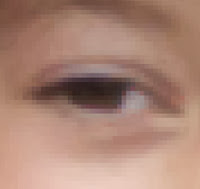
The human eye
Now, let's talk about the actual resolution of the human eye,
computed by Clarkvision to be about 576 megapixels.
That seems like too large a number, and actually it seems ridiculously high. Well, there are about 100 million rods and only about 6-7 million cones. The rods work best in our night vision because they are so incredibly low-light adaptive. The cones are tightly packed in the foveal region, and really only work in lighted scenes. This is the area we see the most detail with. There are three kinds of cones and there are more red-sensitive cones than any other kind. Cones are usually called L (for large wavelengths), M (for medium wavelengths), and S (for small wavelengths). These correspond to red, green, and blue. The color sensitivity is at a
maximum between 534 and 564 nanometers (the region between the peak sensitivities of the L and M cones), which corresponds to the colors between lime green and reddish orange. This is why we are so sensitive to faces: the face colors are all there.
I'm going to do some new calculations to determine how many pixels the human eye actually does see at once. I am defining pixels to be rods and cones, the photosites of the human eye. The parafoveal region is the part of the eye you get the most accurate and sharp detail from, with about 10 degrees of diameter in your field of view. At the fovea, the place with the highest concentration, there are
180,000 rods and cones per square millimeter. This drops to about 140,000 rods and cones at the edge of the parafoveal region.
One degree in our vision maps to about 288 microns on the retina. This means that 10 degrees maps to about 2.88 mm on the retina. It's a circular field, so this amounts to 6.51 square millimeters. At maximum concentration with one sensor per pixel, this would amount to 1.17 megapixels. The 10 degrees makes up about 0.1 steradians of solid angle. The human field of vision is about 40 times that at 4 steradians. So this amounts to 46.9 megapixels. But remember that the concentration of rods and cones falls off at a steep rate with the distance from the fovea. So there are at most 20 megapixels captured by the eye in any one glance.
It is true that the eye "paints" the scene as it moves, retaining the information for a larger field of view as the parafoveal region sweeps over the scene being observed. It is also true that the human visual system has sophisticated pattern matching and completion algorithms wired in. This probably increases the perceived resolution, but not by more than a factor of two by area.
So it seems unlikely that the human eye's resolution can exceed 40 megapixels. But of course we have two eyes and there is a
significant overlap between them. Perhaps we can increase the estimate by 20 percent, to 48 megapixels.
If you consider yourself using a retina display and then extrapolate to the whole field of view, this is pretty close to what we would get.
So this means that a camera that captures the entire field of view that a human eye can see (some 120 degrees horizontally and 100 degrees vertically in a sort of oval-shape) could have 48 megapixels and you could look anywhere on the image and be fooled. If the camera were square, it would probably have to be about 61 megapixels to hold a 48 megapixel oval inside. So that's my estimate of the resolution required to fool the human visual system into thinking it's looking at reality.
Whew!
That's a lot of details about the human eye and sensors! Let's sum it all up. To make a valid image with human-eye resolution, due to Airy disc size and lens capabilities, would take a camera and lens system about the size and depth of the human eye itself! Perhaps by making sensors smaller and improving optics to be flexible like the human eye, we can make it twice as good and half the size.
But we won't be able to put that into a smartphone, I'm pretty sure. Still, improvements in lens quality, BSI sensors, wave guide technology, noise reduction, and signal processing, continue to push our smartphones to ever-increasing resolution and clarity in low-light situations. Probably we will have to have cameras with monochromatic (rod-like) sensors to be able to compete with the human eye in low-light scenes. The human retinal system we have right now is so low-light adaptable!
Apple and others have shown that cameras can be smaller and smaller, such as the excellent camera in the iPhone 5S, which has great low-light capabilities and a two-color flash for better chromatic adaptation. Nokia has shown that a high-resolution sensor can be placed in bigger-thicker-heavier phones that has the flexibility for binning and better optics that push the smartphone cameras ever closer to human-eye capabilities.
Human eyes are hard to fool, though, because they are connected to pattern-matching systems inside our visual system. Look for image interpretation and clarification algorithms to make the next great leap in quality, just as they do in the human visual system.
So is it bigger pixels or simply more of them? No, the answer is
better pixels.
 Knots are also intertwining, and sometimes present a bit of complexity when rendering them. Separate ends may be intertwined, as when we tie our shoes. But loops can also intertwine, and this creates a kind of impossible figure because they are most difficult to actually make. As with Borromean rings and the Valknut, we can also use twists and loops.
 Now I'd like to show a natural extension of the figure eight intertwined with a simple loop. I designed this form a few days ago, but it took me a few days to get to a proper rendering. I used the same techniques to produce this as I used in the examples from the previous post. Except that I used a spatter airbrush on a gel layer to create the shading when one thread passes under another.
 Knots have their stylistic origins in antiquity. They were used for ornament and symbology by the Celts, the Vikings, and the ancient Chinese.